Citibanamex
Design System
One bank, four disconnected digital platforms, and users who felt the inconsistency every time they switched between them. This is how we fixed it — and cut design production time in half.
One bank, four disconnected digital platforms, and users who felt the inconsistency every time they switched between them. This is how we fixed it — and cut design production time in half.
Citibanamex was a single institution delivering a fragmented experience. A user could receive a promotional email, click through to the website, and then visit an ATM — and each touchpoint felt like it belonged to a different company entirely.
Different colors, different type treatments, different interaction patterns. No shared language between teams. The brand trust a bank depends on was quietly eroding with every inconsistent pixel.
Create a single, unified design system — built on Atomic Design methodology — that every digital platform team could adopt. One source of truth for components, iconography, color, typography, and interaction patterns.
Not just a style guide. A living library that would make designing faster, more consistent, and easier to maintain across four separate product teams.
This wasn't a project one team could own alone. Every digital platform had its own team, its own constraints, and its own design decisions baked in. For a system to actually work across all of them, everyone needed a seat at the table from the start.
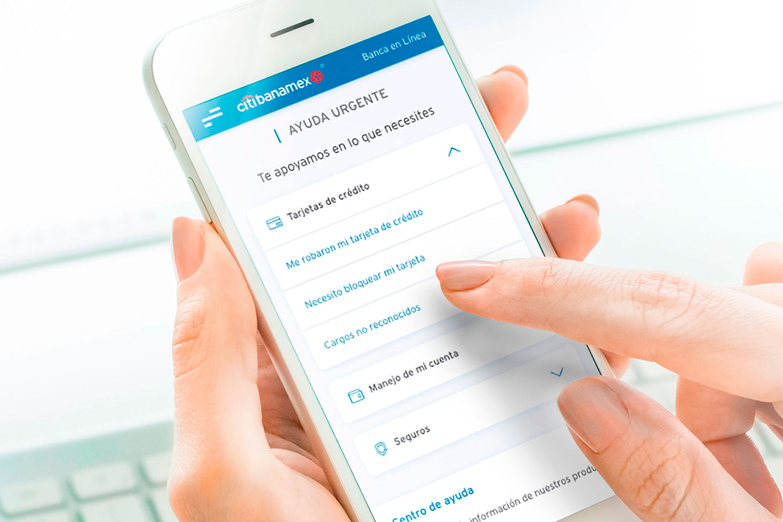
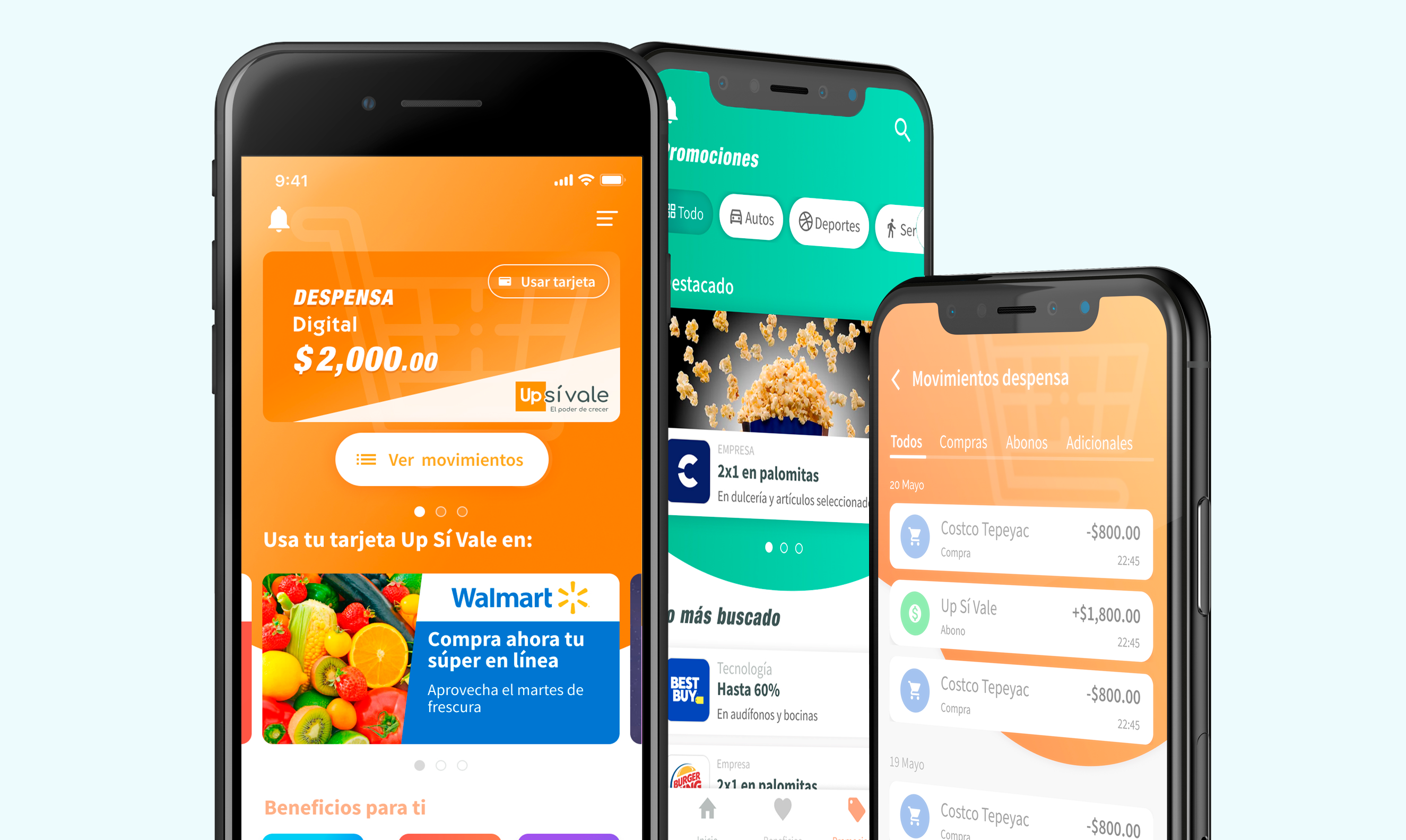
The first digital touchpoint for new customers — where first impressions of the brand were formed.
Corporate-facing platform with its own component needs, distinct from the consumer experience.
The main consumer portal — responsible for building the Atomic Design foundations and core component library.
The most active daily touchpoint, with strict mobile constraints and interaction expectations.
Sessions ranged from 5 to 15 people depending on the agenda — core team members plus stakeholders from each platform. Decisions were made together, not handed down.
Before defining a single component, the committee conducted research across all platforms — mapping the existing visual landscape, understanding user needs at each touchpoint, and benchmarking against design trends in the banking and financial industry.
The goal wasn't to pick a winner between the existing platforms. It was to build something better than any of them — grounded in what users actually needed and what Citibanamex's brand truly stood for.
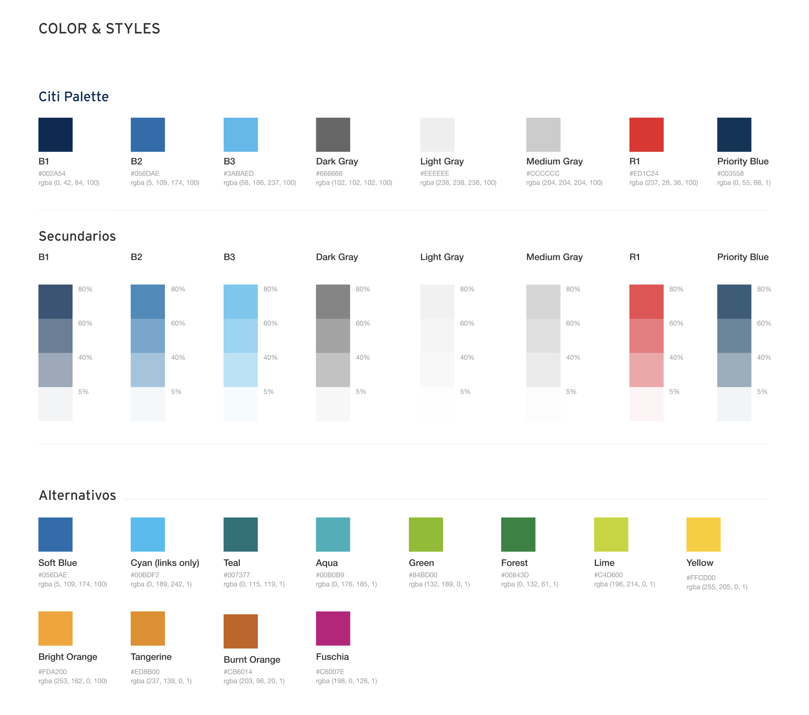
Following Citibank's global brand guidelines as a foundation, the team established a set of principles and UI components built for consistent use across every platform — without flattening the unique needs of each one.
Evoking trust and security, while respecting standard interaction conventions across digital platforms.
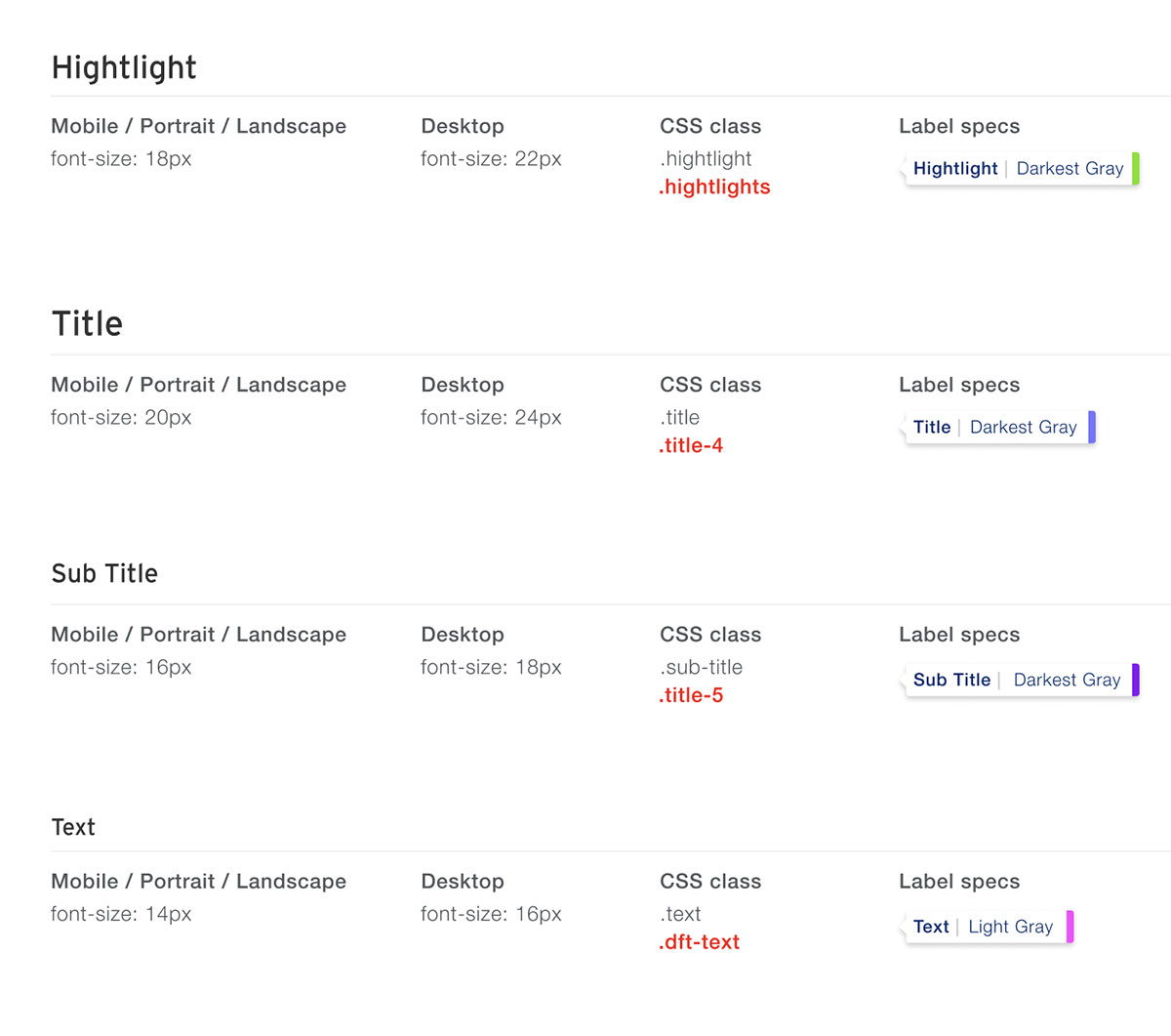
Documented guides for headings, body text, and all typographic elements — with clear hierarchy at every scale.
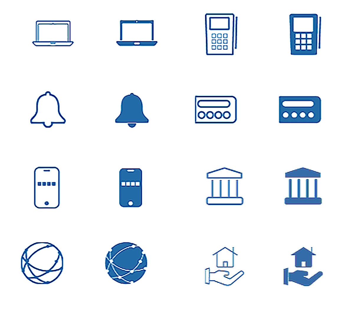
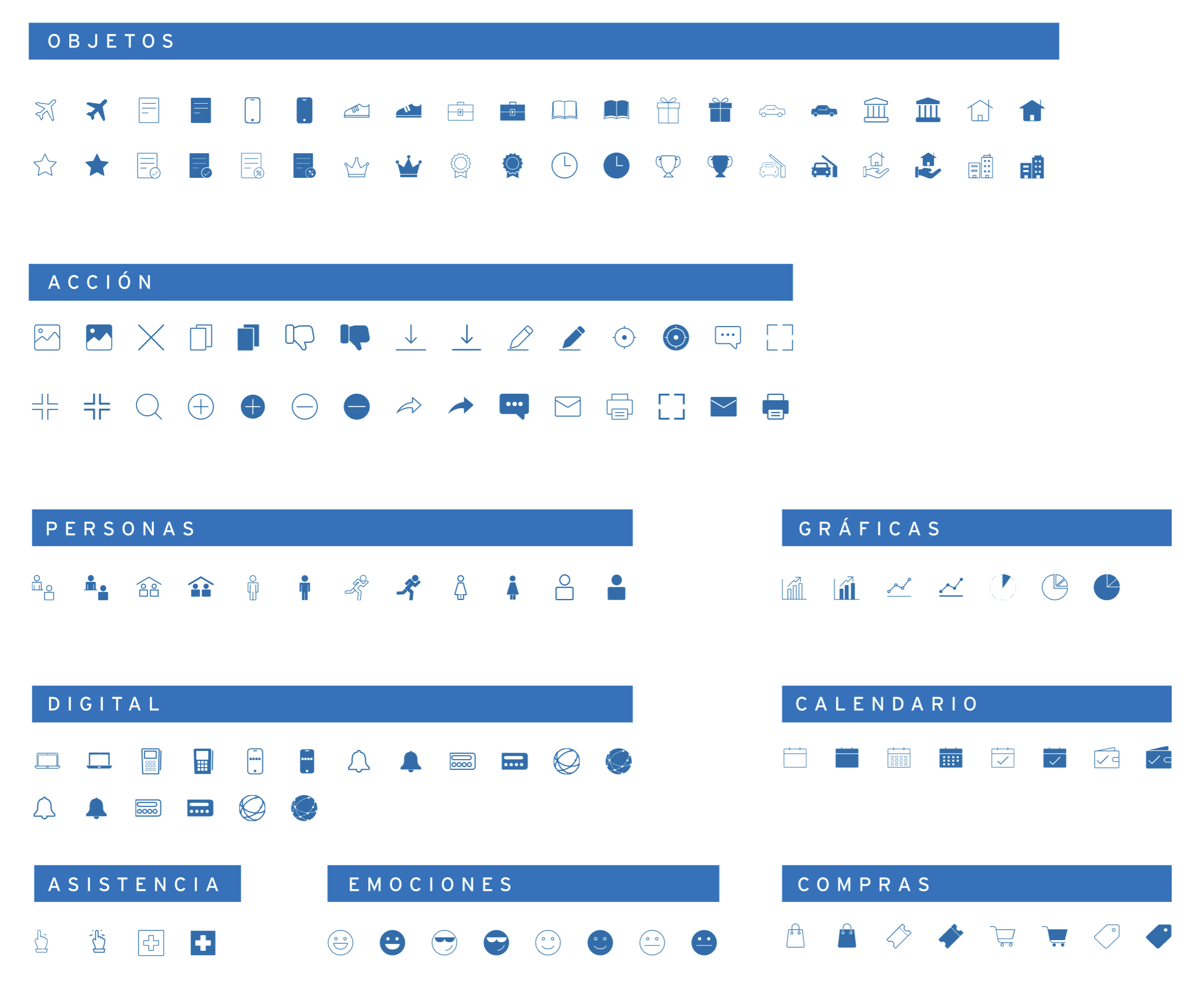
A banking-specific icon set with solid and outlined versions, built on an 8px base grid for pixel-perfect consistency.
Icons are one of the most frequently inconsistent elements across platforms — each team had been solving for the same concepts independently. We ran a card sorting session with the full UX team to define categories, then built every icon from scratch on an 8px grid with both solid and outlined variants.
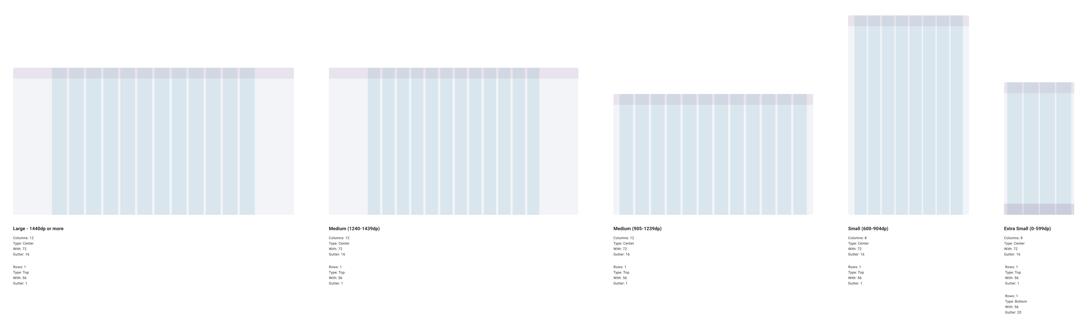
A flexible grid system gave every team a shared spatial language — consistent layout across screens and devices, with a responsive structure that worked fluidly on both desktop and mobile without requiring platform-specific workarounds.
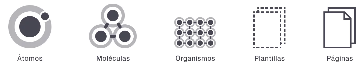
The methodology was Atomic Design — starting from the smallest indivisible units and building upward into progressively more complex UI elements. Atoms like buttons, inputs, and labels combined into molecules: form fields, cards, navigation bars. Molecules into organisms. Organisms into full page templates.
This approach meant every platform was building with the same raw materials — just assembled differently for their specific context.
The critical moment came when decisions turned into a real, usable artifact. A fellow designer from the web portal team and I took on the work of bringing the Atomic Design foundations to life in Sketch — building every component with variants, states, and documentation baked in.
Once the library was built, the committee made a pragmatic decision: publish it on GitHub. It wasn't the simplest path — not everyone on the design teams worked in Sketch — but it was the right one for version control, traceability, and keeping a single source of truth.
Direct access to the live library — components always up to date, pulled straight from the repository into their working files.
A versioned PDF export was available for each release. Not ideal — every update meant downloading a new file — but it kept all teams working from the same reference point.
It was a real constraint, and we knew it. But it was a deliberate trade-off: consistency and traceability over convenience. The system could evolve; the distribution method could too.
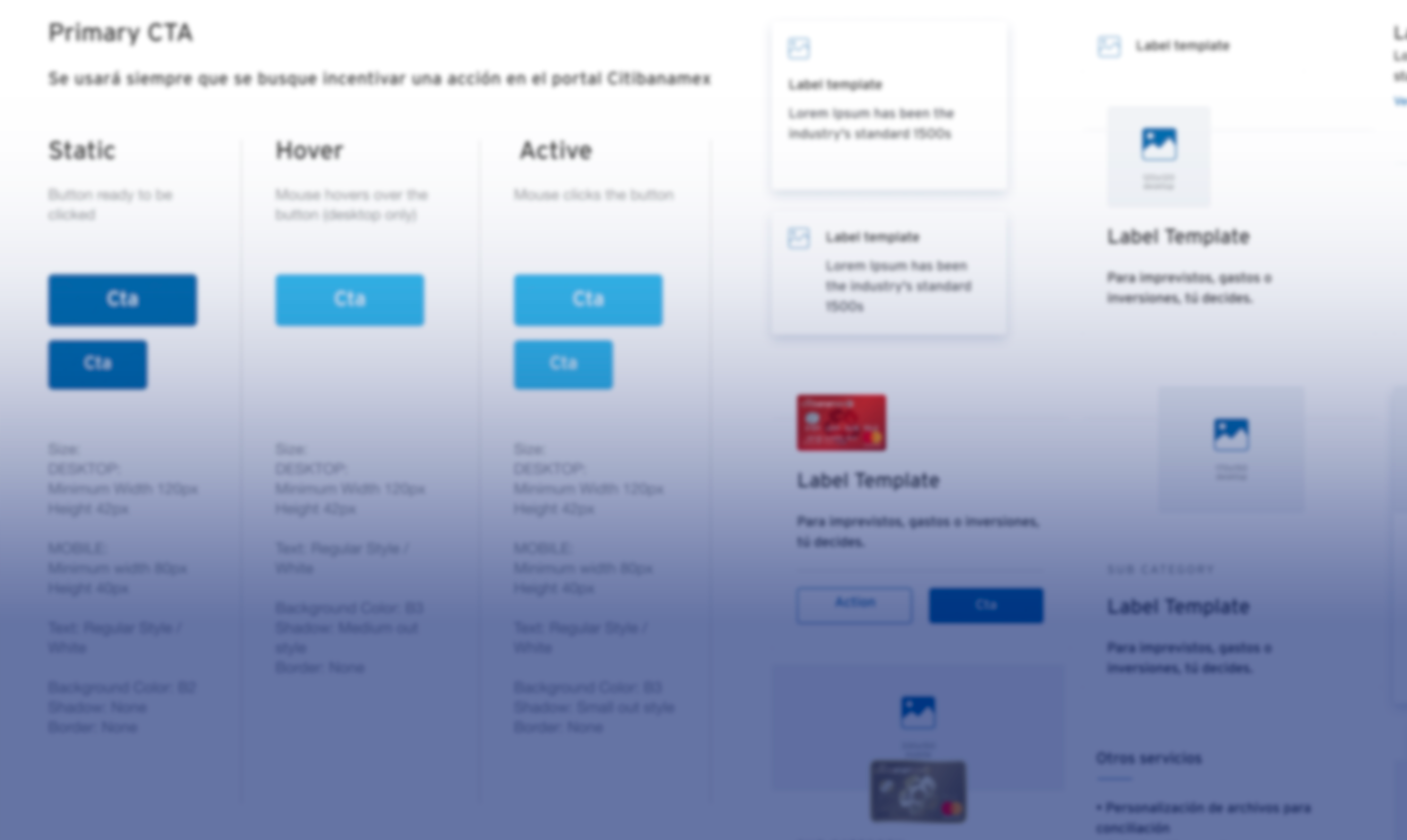
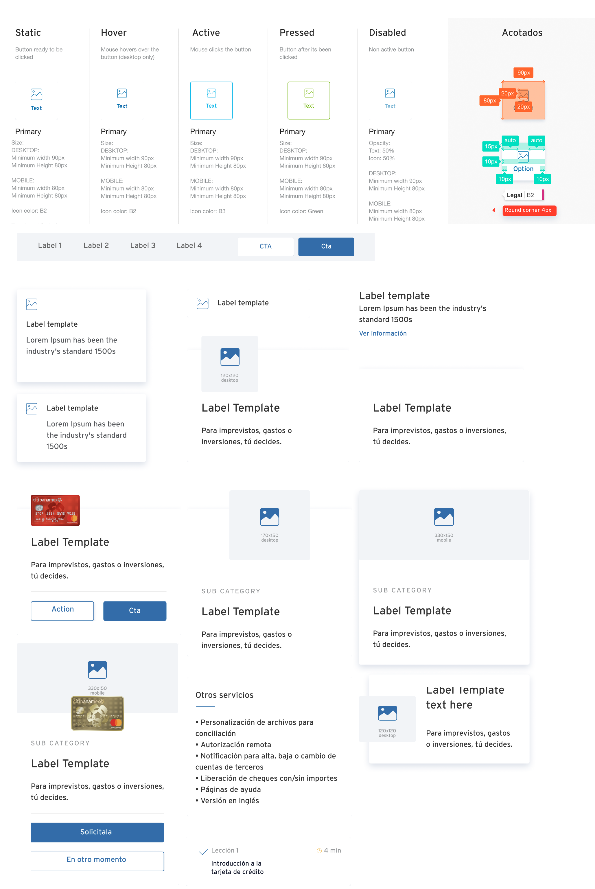
Components don't exist in isolation — they behave. We defined exactly how buttons respond to state changes, how forms are filled and validated, how data is presented in tables and lists. Transitions, animations, and micro-interactions were documented with the same rigor as visual specs — enhancing the experience without adding noise.


A design system is only as good as its adoption. We compiled every guideline, component spec, and asset into comprehensive documentation — written to be useful for designers, developers, and stakeholders alike, not just the people who built it.
Then we ran training sessions across the platform teams. The goal wasn't to enforce rules — it was to make the system feel like a tool people wanted to use, not one imposed on them.