$1M+ Revenue
on a Redesign Strategy
Complete redesign of the UP Sí Vale app: from a basic balance-check tool to an active marketplace — and the organizational transformation that made it sustainable.
Complete redesign of the UP Sí Vale app: from a basic balance-check tool to an active marketplace — and the organizational transformation that made it sustainable.
Over a million users had money loaded onto their UP Sí Vale cards every month. Corporate benefits, ready to spend. And yet — almost nobody was spending it.
Not because they didn't want to. Because the app gave them no reason, no direction, and no moment to act. Users opened it, checked their balance, and left. A million potential active customers, sitting idle.
The existing app was functional in the most minimal sense: balance, transaction history, and a benefits section with zero segmentation. It did what it said it would do — nothing more.
There were no promotions, no discovery, no reason to come back. The app was invisible in users' daily lives, and the business was leaving real revenue on the table.
Before touching a single screen, we went to the source. Qualitative and quantitative research with real users confirmed what we suspected — and gave us the language to bring stakeholders along.
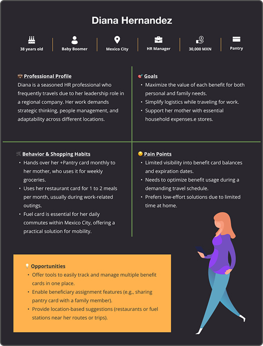
Based on the innovation team's research, we identified two core user profiles and built personas around both — grounding every design decision in real behavior and real frustrations.
Three patterns emerged clearly across all research — each pointing to the same root cause: users had value available, but the product wasn't surfacing it.
Users opened the app once a month to check their balance. Nothing in the experience encouraged a second action.
Users didn't know where to spend their balance. The app had no way to discover brands, promotions, or nearby locations.
The existing design didn't follow accessibility best practices — excluding a meaningful part of the user base entirely.
We followed a structured, iterative process — keeping design decisions grounded in research at every step, and stakeholders informed throughout.
Low-fidelity wireframes were the foundation for rethinking the app's information architecture. Every layout decision was tested and discussed before moving to high fidelity — keeping stakeholder feedback loops short and meaningful.
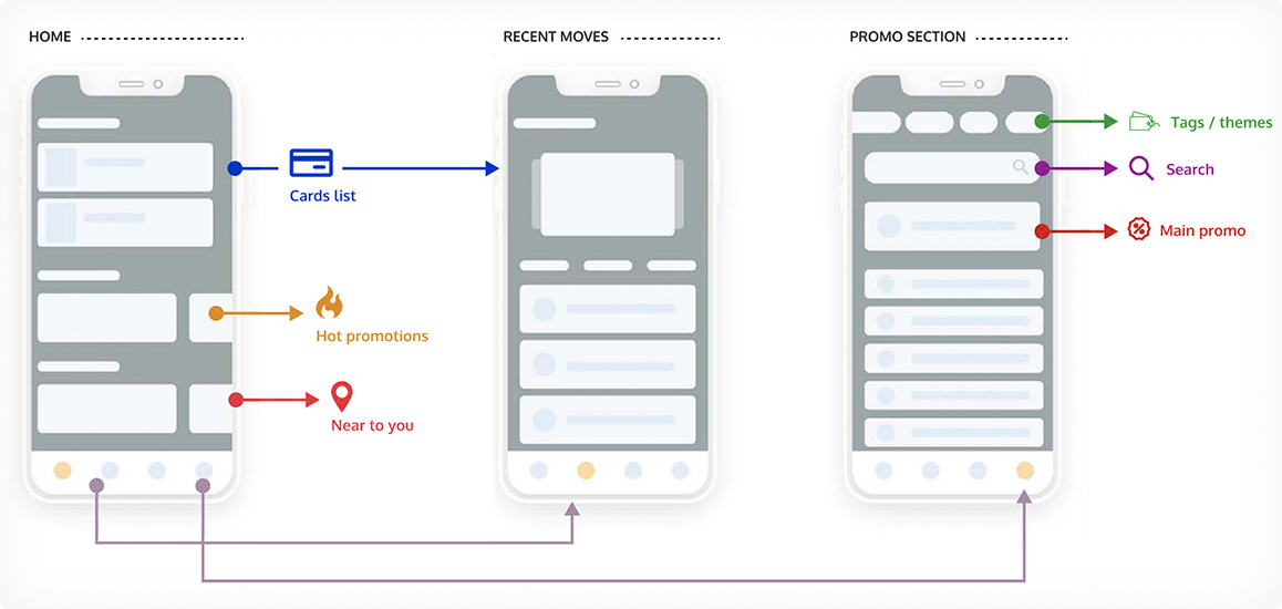
Low-fidelity wireframes defined the new IA · High-fidelity prototype used for usability testing
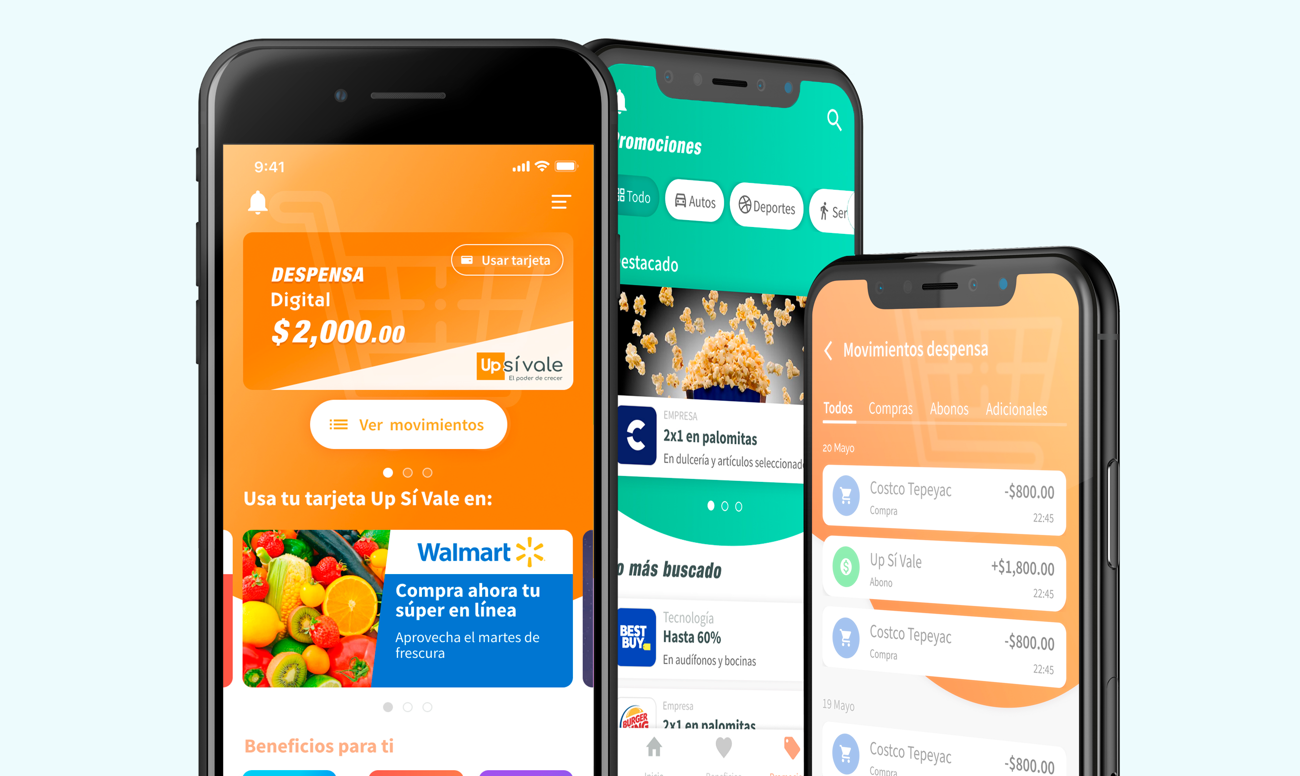
Every decision had a user reason behind it. The card now looked like a physical one — a familiar metaphor that made the digital feel tangible. Promotions, categories, filters, nearby locations, and search gave users a reason to come back.
UI improvements
Added value for users
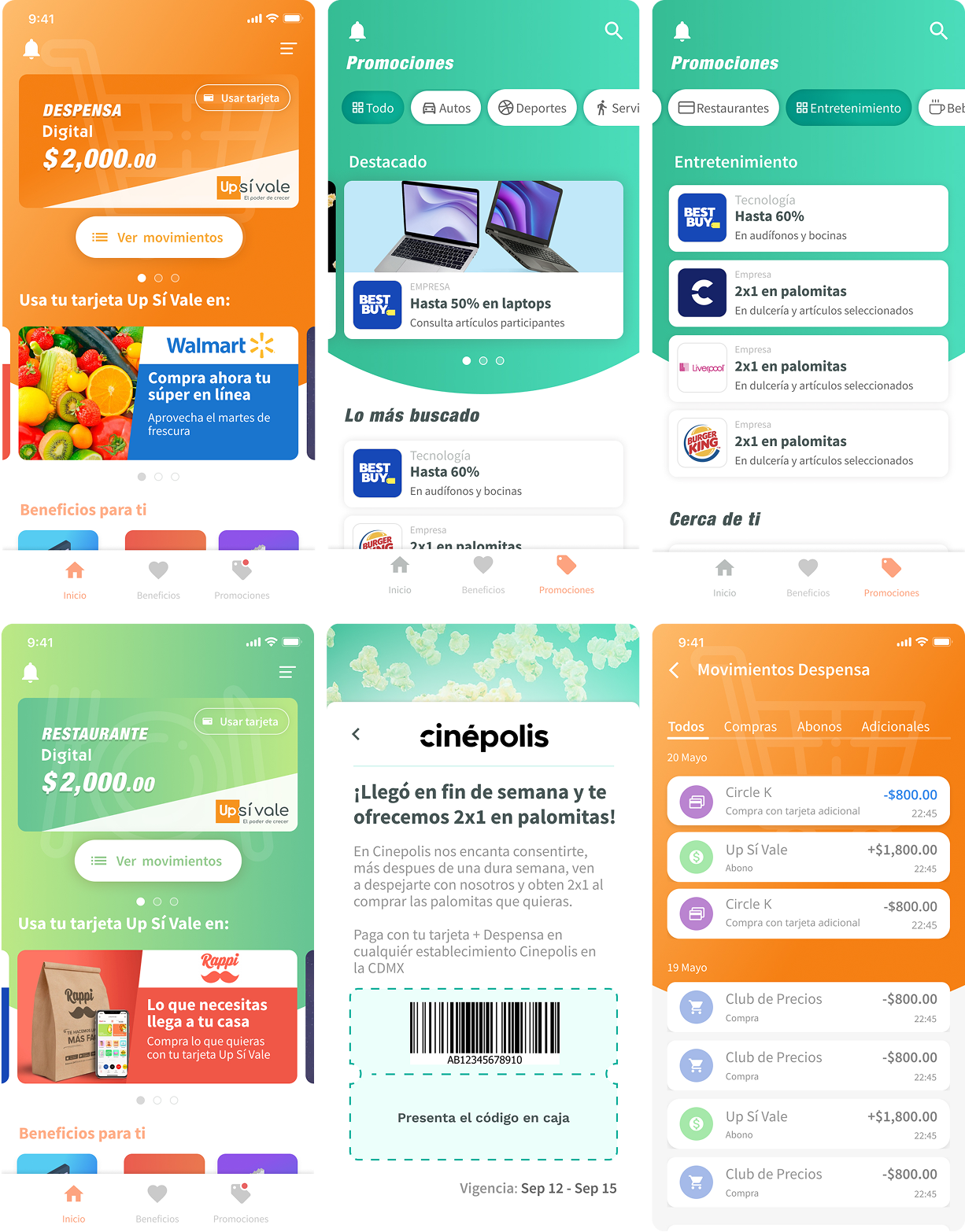
Phase 1 launched with just the redesigned home and five promotional slots in the carousel below the card. The response was immediate — and overwhelming. Partner companies started flooding in, all wanting their brand featured in the top positions.
The Alliances team, excited by the demand, began committing to launch dates. The problem: they had no visibility into the design and development process running in parallel. They assumed adding a promotion meant uploading an image. In reality, it meant managing a CRM — assigning the partner company, generating correctly-sized assets, creating segmentation tags, scheduling carousel placement, and programming exact go-live dates.
We were still in active biweekly sprints for Phase 2. Promises made without process awareness started colliding with our delivery timeline. The team was working overtime — and it wasn't sustainable.
Rather than absorbing the friction indefinitely, my Innovation lead and I decided to address the root cause. We designed and ran an internal workshop for the teams making commitments — walking them through how the design system worked, what Scrum looked like in practice, and exactly what was already defined and in motion.
The goal wasn't to protect our process for its own sake. It was to make the entire operation function: if Alliances understood what was involved, they could make promises that were actually deliverable — and everyone would win.
The response was positive. It didn't just resolve the immediate conflict — it shifted how teams related to each other's work.
To make the new culture of transparency permanent, we established a cross-functional committee — bringing together the heads of every area involved in the product. Biweekly meetings, a shared agenda, and a written minute distributed by email after each session kept everyone aligned in real time.
Each team had a defined role at the table:
Negotiating promotion packages — carousel placement, pricing, and contract details with partner companies.
Expanding the partner ecosystem and generating new contracts with companies not previously on the platform.
Making design decisions to deliver the best possible user experience within the new marketplace strategy.
Leading daily Scrum standups — reporting progress, blockers, requirements, and anything within their scope.
Creating new promotions and managing agreements with card issuers to drive user engagement.
Bringing real user questions, complaints, and functionality issues directly to the table from the field.
Every two weeks, everything went on the table: progress, blockers, delivery dates, open requirements. A written minute went out by email after every session — full transparency, no assumptions, no surprises. This was 2020, before AI could do the admin work for you.
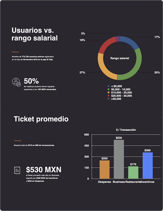
Numbers from the first two months after launch — before Phase 2 was even complete.
Beyond the business numbers, the redesign changed the daily relationship users had with their benefits.
The most lasting outcomes of this project weren't in the app — they were in the organization around it.
Led initiatives to embed UX principles across the organization through Design Thinking workshops and Agile collaboration practices. Increased stakeholder buy-in, resulting in stronger cross-functional alignment and more user-centered product decisions across every team.
Established the design governance committee that connected Product, Technology, and business stakeholders. Standardized design tokens, improved visibility into design initiatives, and ensured consistent UX implementation across multiple teams and projects going forward.