← Stories
UP Sí Vale · 2020

Transforming a Wallet into a Business Platform

The app worked exactly as intended.
The problem was that its purpose was too small.

Company
UP Sí Vale
Role
UX Lead · Product Designer
Duration
2020
Responsibilities
Product Strategy, UX Research, Interaction Design, Information Architecture, Usability Testing, Design QA, Stakeholder Alignment
Outcome
Redesigned the product strategy, introduced a promotions ecosystem, increased business opportunities through strategic partnerships, and established a cross-functional product governance process.
$4M+ Revenue generated through new strategic partnerships
22Strategic partners
400KNew mobile users
1.2MMonthly active users
170MPromotion impressions

The Product Already Worked

When I joined UP Sí Vale, the mobile application had just been visually redesigned. It looked more modern, but the product itself remained almost unchanged.

Employees could check their card balance and review recent transactions. Once they confirmed their deposit had arrived, they closed the application until the next payday.

The product fulfilled its technical purpose. It simply wasn't creating continuous value — neither for employees, nor for the business.
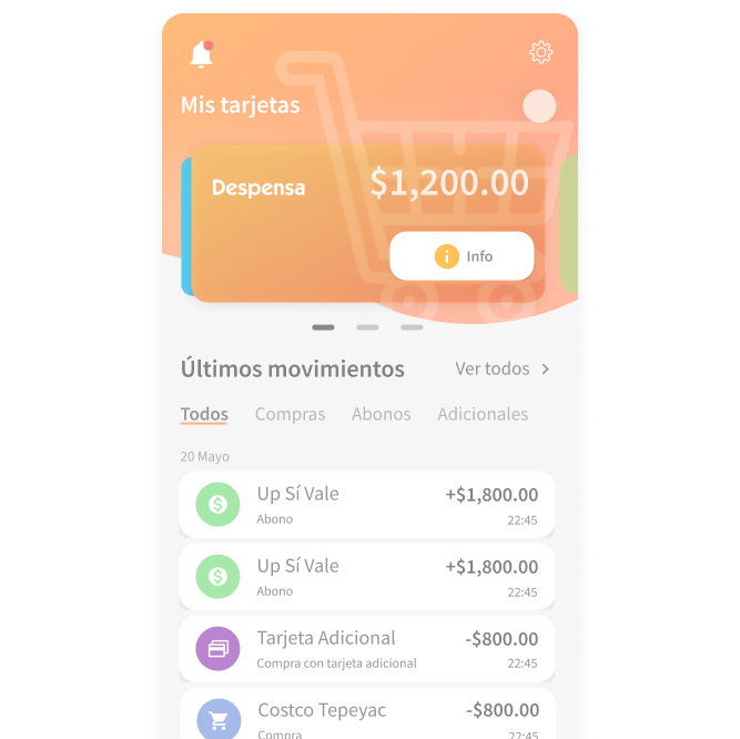
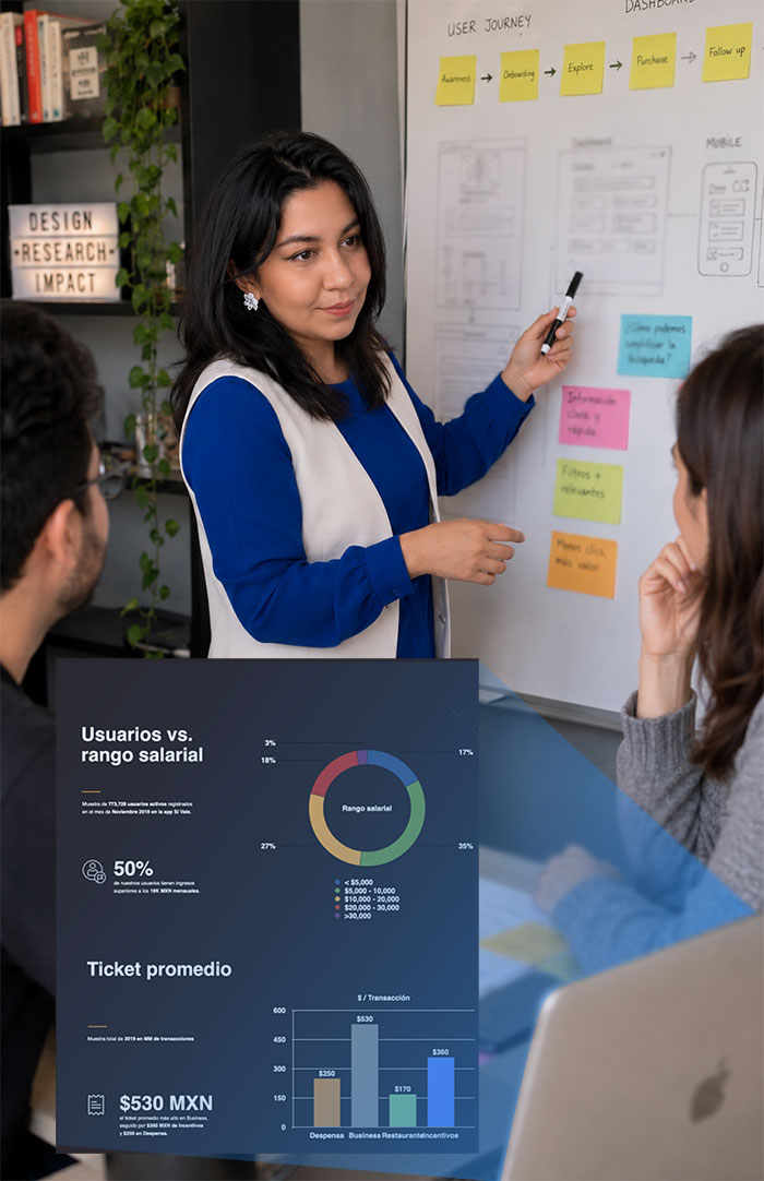
The application focused exclusively on balance inquiries and transaction history.

Understanding the Opportunity

One advantage we had was that we weren't researching strangers. My Innovation Lead and I were also users of the product — we experienced the same frustrations every month.

Whenever we wanted to use our benefit card, we weren't sure where it would actually be accepted. Sometimes it worked. Sometimes it didn't. The application didn't answer that question. Neither did the company's website. Most employees relied on assumptions or trial and error.

That experience became our first hypothesis.

Research

Instead of jumping directly into redesigning the interface, we wanted to validate whether our own experience represented a broader user problem. The Innovation team analyzed installation and usage data while we conducted qualitative interviews and usability testing.

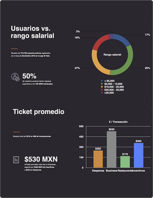
The findings were remarkably consistent. Although thousands of employees had the application installed, most users opened it only on payday — it wasn't part of their daily lives.

  • Users only opened the app on payday.
  • Employees didn't know where they could use their benefits.
  • Information about participating merchants wasn't easily accessible.
  • Existing navigation created uncertainty rather than confidence.

"I never knew where I could actually use my card, so I'd usually just take my chances."

UP Sí Vale employee, usability interview

Users weren't asking for more features. They were asking for confidence.

Reframing the Problem

At first glance, it seemed like users simply needed a list of participating stores. Research revealed something different.

The real problem wasn't information. It was confidence. Employees already had money available — they simply weren't confident about using it.

That insight completely changed our strategy. Instead of asking "What feature should we add?" — we started asking "How can this product become useful beyond payday?"

Product Strategy

The company had already established strategic partnerships with brands like Walmart, Starbucks and 7-Eleven. Those partnerships represented value — the problem was that users couldn't easily discover them. At the same time, partner brands had no meaningful visibility inside the product.

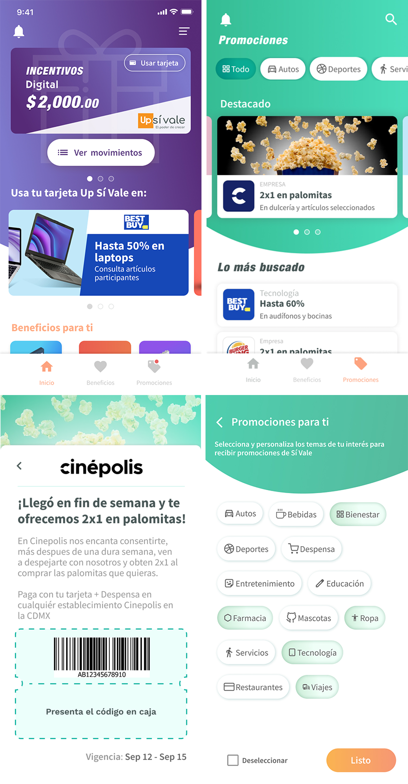
Rather than designing another informational screen, we proposed transforming the application into a discovery platform connecting employees with participating merchants. That single decision aligned user needs with business goals.

Designing a Roadmap, Not a Release

We deliberately approached the redesign as a product evolution rather than a one-time launch.

Phase 1
Focus: reduce uncertainty.
  • Introduce partner promotions.
  • Increase engagement.
  • Help employees discover where they could use their benefits.
  • Create new commercial visibility for partner brands.
Phase 2
Focus: increase relevance.

Our long-term roadmap included:

  • Personalized recommendations based on card type.
  • Interest-based categories.
  • Location-aware offers.
  • Nearby participating stores.
  • Behavioral personalization.

Although this second phase was never implemented after our team left the organization, it demonstrated how we envisioned the product evolving over time.

Usability Testing

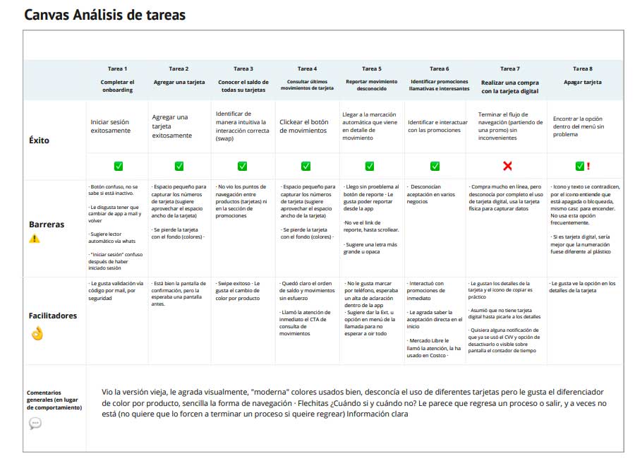
The first release wasn't considered finished. It became the starting point for another research cycle.

We conducted usability tests to identify friction points and prioritize quick wins before continuing the roadmap.

Observation

Users expected the back button to close the application instead of navigating backwards.

Decision

We redesigned the navigation flow to better match user expectations.

Growing the Product Meant Growing the Team

The launch created something we hadn't anticipated: new business opportunities.

Marketing wanted promotional campaigns. Partnerships negotiated new commercial agreements. Customer Support reported recurring issues. Engineering managed releases. UX continued researching and validating future improvements.

Everyone cared about the product. But everyone understood it differently.

The different areas were aware of the app launch, but disconnected after that.

Building Alignment

Instead of trying to work faster, we focused on helping everyone understand how product decisions were made.

Together with my Innovation Lead, I organized workshops introducing:

  • UX principles
  • Design Thinking
  • Sprint planning
  • Product roadmap
  • Research methodology

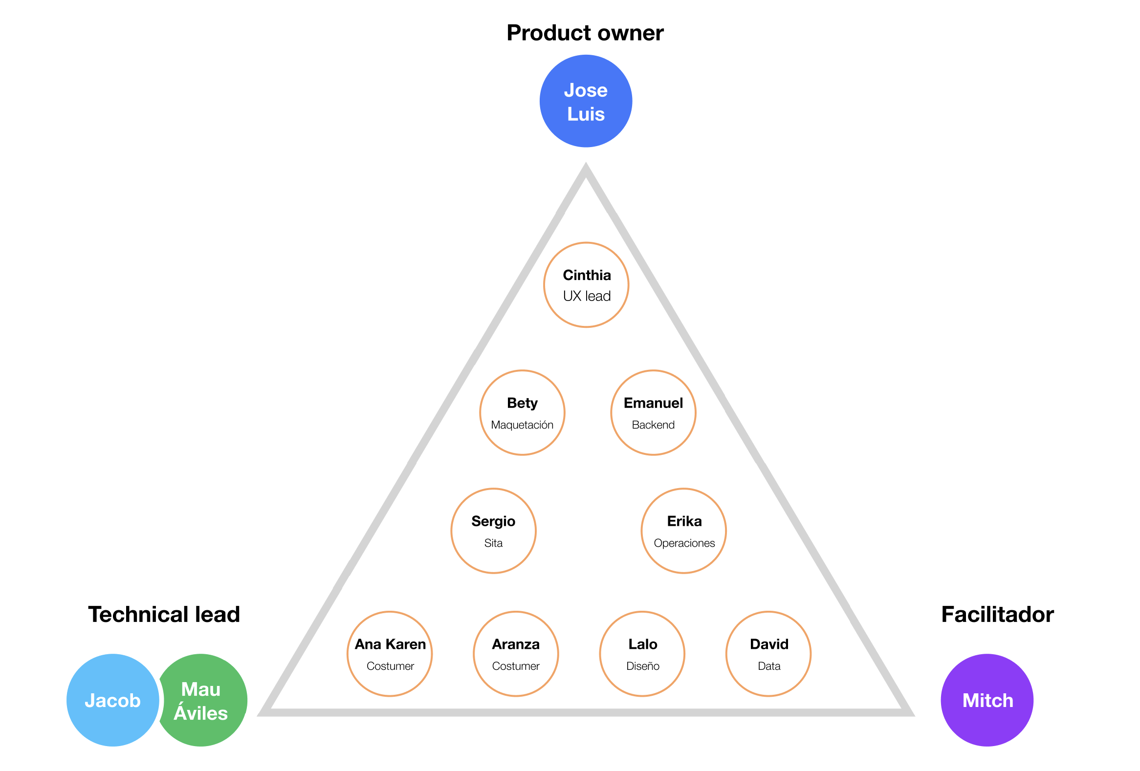
These sessions evolved into recurring cross-functional product reviews involving Product, Engineering, Marketing, Partnerships, Customer Support and UX. Every department gained visibility into roadmap priorities, blockers, customer feedback and upcoming releases. Meeting notes ensured alignment even when stakeholders couldn't attend.

Product Eng. Marketing Support Partners UX

Impact

For Users

  • Greater confidence using their benefits.
  • Easier discovery of participating merchants.
  • More reasons to return beyond payday.

For Business

  • New visibility for strategic partnerships.
  • Additional commercial opportunities.
  • Increased value from an existing digital channel.

For the Organization

  • Cross-functional product governance.
  • Shared understanding of UX methodology.
  • Better roadmap alignment.
  • Reduced unrealistic delivery expectations.

Good products don't become indispensable in a single release. They evolve through continuous discovery.

Years later, I became a UP Sí Vale user once again. The first phase of the vision remains visible in today's product. The second phase never happened. Surprisingly, that isn't what I remember most. What stayed with me was realizing that successful products aren't built by adding features — they're built by helping organizations ask better questions. The biggest lesson from this project wasn't learning how to redesign an application. It was learning that the greatest opportunities often emerge when we challenge the original purpose of a product.

Design deep dive Mobile App Redesign

This case study covers the why — product strategy and business impact. That one covers the how: visual language, accessibility, and the component system behind it.

View the deep dive
Next case study Designing a Better All Hands Experience View case study