← Stories
Publicis Sapient · 2026

Designing a Better All Hands Experience

Transforming workshop insights into a scalable communication system for a distributed design organization.

Company
Publicis Sapient
Team
Experience Design LATAM
Role
UX/UI Designer (Volunteer Initiative)
Scope
Experience Strategy · Design System · Content Strategy · Documentation
Tools
Figma, FigJam

Overview

Publicis Sapient's Experience Design LATAM team already held a monthly All Hands session where designers from different countries shared updates, celebrated achievements, and connected as a community. As different teams rotated ownership every month, the quality and structure of each session naturally evolved in different directions.

A collaborative workshop was organized to understand what was working, what wasn't, and how the experience could become more engaging and sustainable.

Inspired by the outcomes of that workshop, I volunteered to help transform those insights into a reusable framework that future teams could adopt. My contribution focused on translating research findings into a scalable experience strategy, supported by clear documentation, reusable templates, and a shared design library.
Understanding the Opportunity

Starting from a workshop, not a blank page.

Instead of assuming what needed to change, the organization first invited designers to openly discuss the current experience.

The goal wasn't to redesign the meeting from scratch. It was to understand how the existing All Hands could evolve while preserving what people already valued.

The workshop surfaced recurring themes around participation, storytelling, collaboration, and consistency.

Workshop Findings

What people loved. What held it back.

The workshop revealed several important patterns.

What People Loved
  • Relaxed atmosphere
  • Project showcases
  • Practical tutorials
  • Learning from peers
  • Feeling connected as one LATAM community
Recurring Challenges
  • Repetitive agendas
  • Long operational updates
  • Inconsistent storytelling
  • Declining engagement throughout the session
  • Little guidance for new organizing teams
Experience Analysis

Engagement dropped as the session went on.

One insight particularly stood out: engagement consistently decreased as the meeting progressed.

The emotional journey showed that attendees were highly engaged at the beginning, but gradually disconnected during lengthy updates and predictable presentation formats.

This shifted the challenge from simply improving slides to designing a better experience rhythm.

Session starts strong, but loses energy progressively

Engagement Session time → 🙂 😄 🙂 😐 😐 🙁 🥱 😴
  • Comments on long monologues
  • Complains about poor time management
Opportunity Prioritization

Not everything needed to change at once.

Instead of immediately jumping into visual design, workshop outcomes were organized into two groups — separating tactical improvements from strategic opportunities, so the framework would be easier to adopt over time.

Quick Wins

Improvements that teams could adopt immediately.

Big Bets

Long-term initiatives that required organizational alignment.

🏃Quick Wins

  1. Reduce long operational announcements.
  2. Set a maximum format for updates (e.g., 3-3-3: 3 wins, 3 learnings, 3 focus areas).
  3. Include a mandatory "1 practical takeaway" per session.
  4. Rotating MC role.
  5. Micro-interactions per block (emoji check, quick poll, word cloud).
VS

🏪Big Bets

  1. Formal integration of managers as leaders (aligned with the "Get Managers Involved" playbook).
  2. Visible recognition system (not necessarily monetary).
  3. Recurring segment for real user stories / impact.
  4. Light gamification (participation points, symbolic monthly leaderboard).
Experience Principles

A philosophy, not a rulebook.

The next step was translating research insights into a set of guiding principles — establishing a shared philosophy for creating engaging experiences, rather than prescribing rigid rules.

Value over Information

If something can be solved by email, there's no need to bring it to All Hands. The focus is on conversations, context, and decisions that truly matter—worth sharing and discussing live.

Progressive Participation

Different levels of interaction to keep people engaged without overwhelming them, combining lighter engagement (polls, reactions) with more active spaces (short, dynamic activities).

Rotating Voices

Encourage different people to participate and lead the space, bringing more diversity, richer conversations, and more opportunities for growth.

Mindful Energy

Design a dynamic experience and rhythm that blends moments of high energy, pauses, and shifts in intensity to keep attention high and wrap up in an agile and memorable way.

Sustainability over Spectacle

Create sustainable spaces over time, built on simple dynamics, meaningful conversations, and genuine participation, without relying on incentives or excessive resources.
Session Architecture

Content categories, not a fixed agenda.

One of the biggest opportunities wasn't visual consistency — it was helping teams organize content more intentionally. The objective shifted from "covering topics" to designing meaningful experiences.

Connect Learn Inform

Connect

Opens the session and grounds the room before any content is shared.

Learn

The core of the session — the work, ideas, and stories worth sharing that month.

Inform

Organization and business updates, delivered with the same visual language.

Rather than following a fixed agenda, teams could combine these sections according to the needs of each session.

The goal isn't to check a box with everyone,
but to create a session that truly delivers value.

Examples:

AH month 1
Connect Learn Inform
AH month 2
Connect
AH month 3
Learn Inform
Connect
Operational Framework

Ownership needed to be simple.

Since a different team organized every monthly session, I documented a repeatable process that clarified:

  • Planning timeline
  • Responsibilities
  • Kickoff meetings
  • Facilitator roles
  • Preparation milestones
  • Delivery expectations

This reduced uncertainty and made it easier for any team to take ownership.

Building the Design System

Consistent, without being identical.

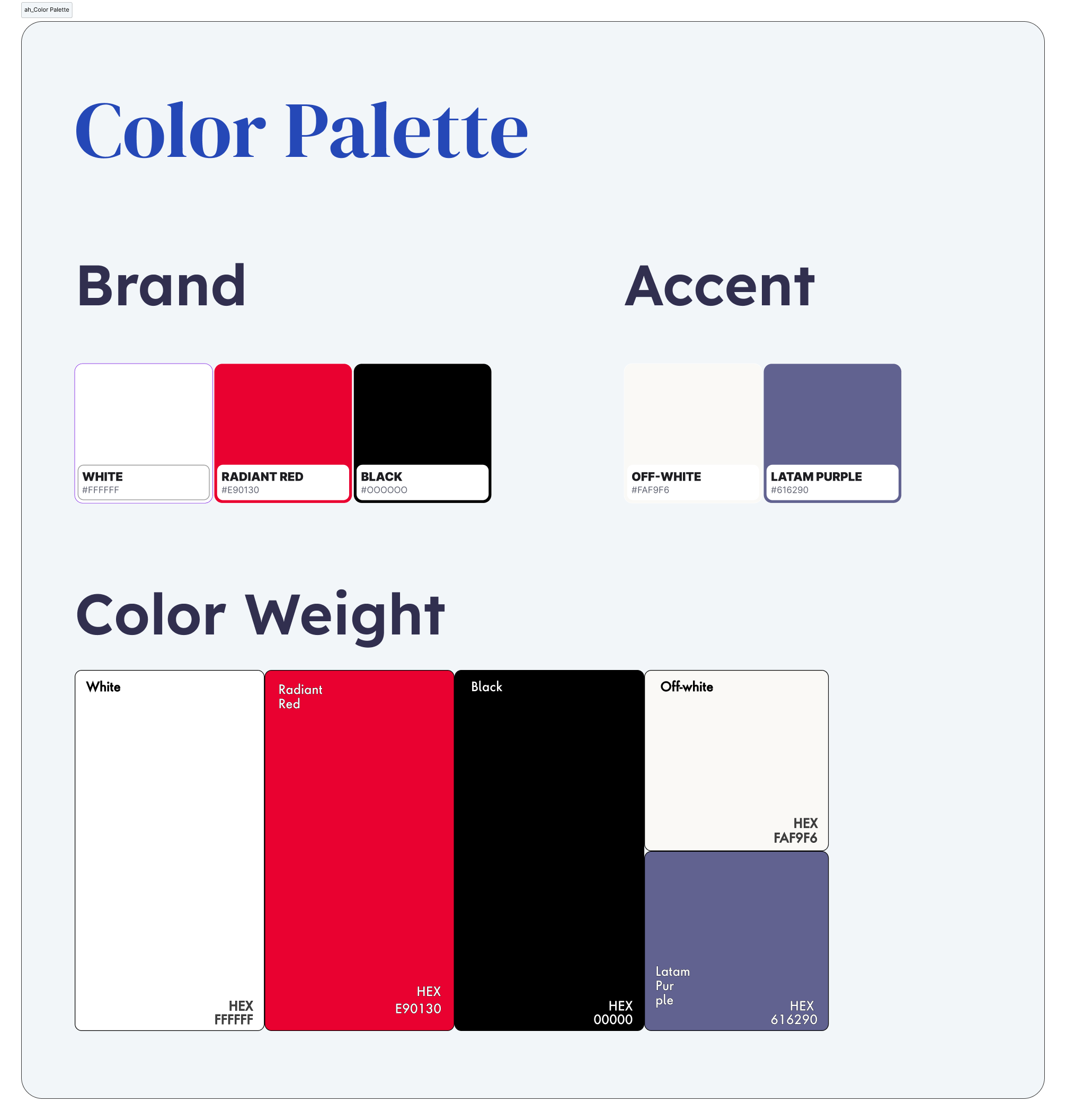
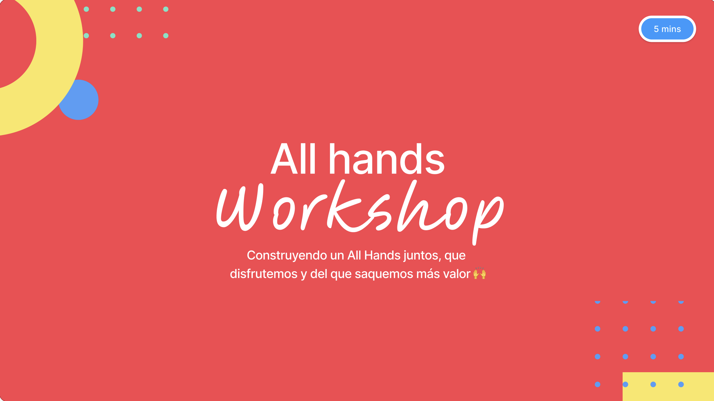
With the experience framework established, the next focus was the visual system that would support it — not to make every presentation look the same, but to create enough consistency for every session to feel part of the same experience, while still leaving room for each organizing team's personality.

Shared Figma Library

Design once. Reuse every month.

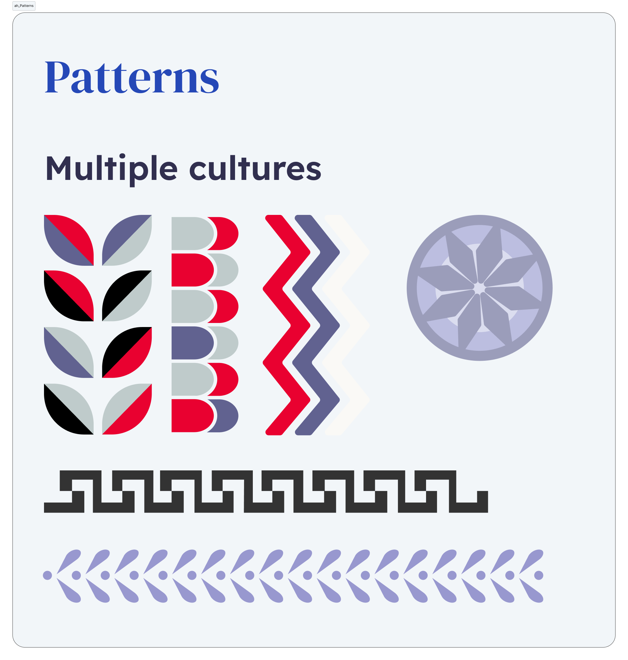
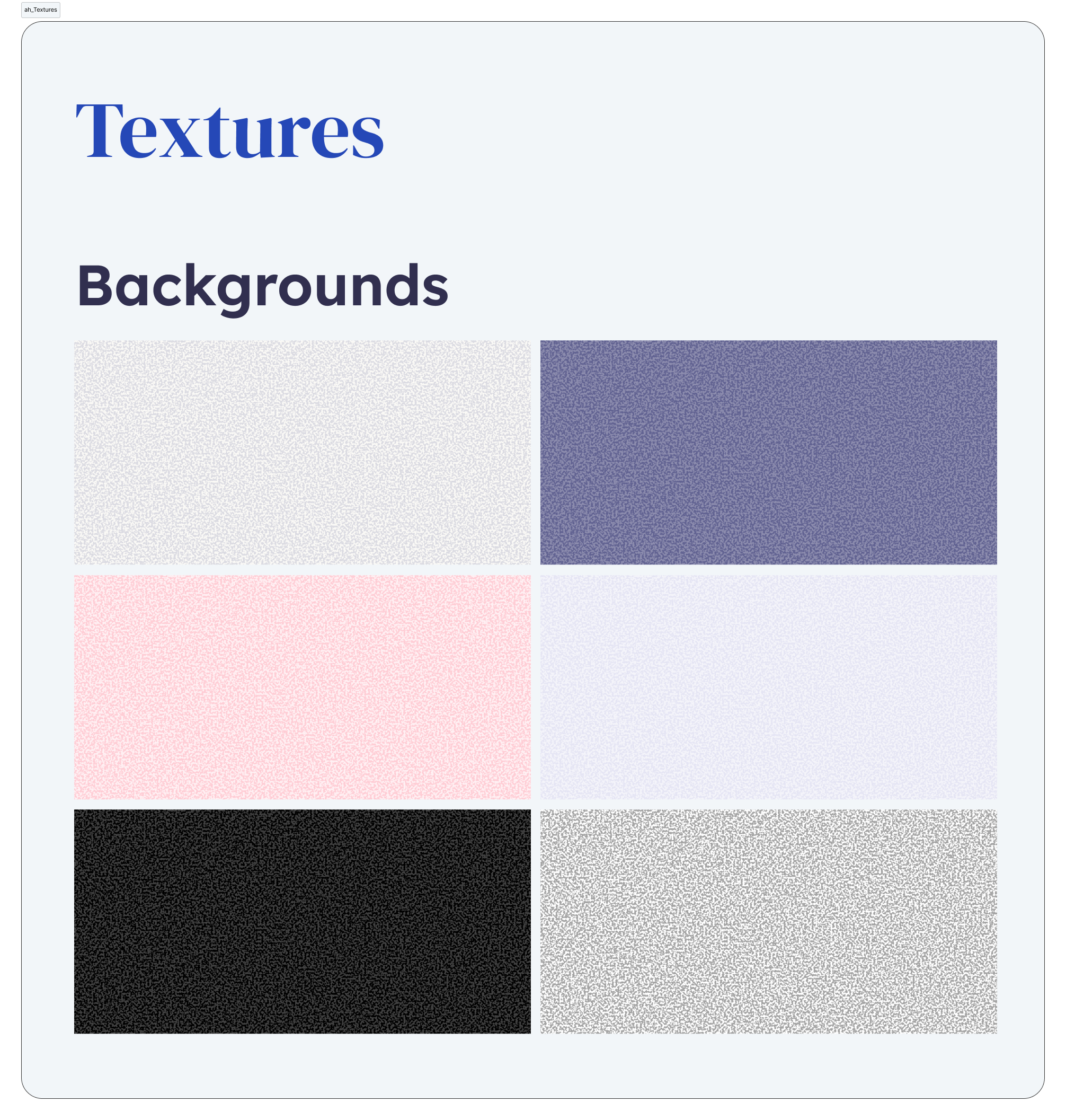
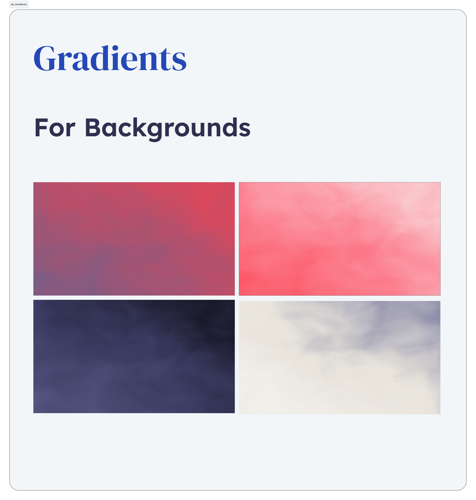
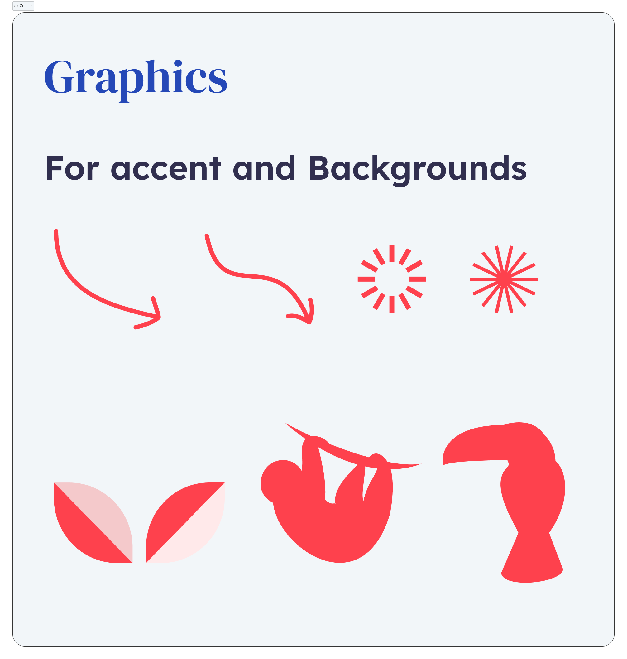
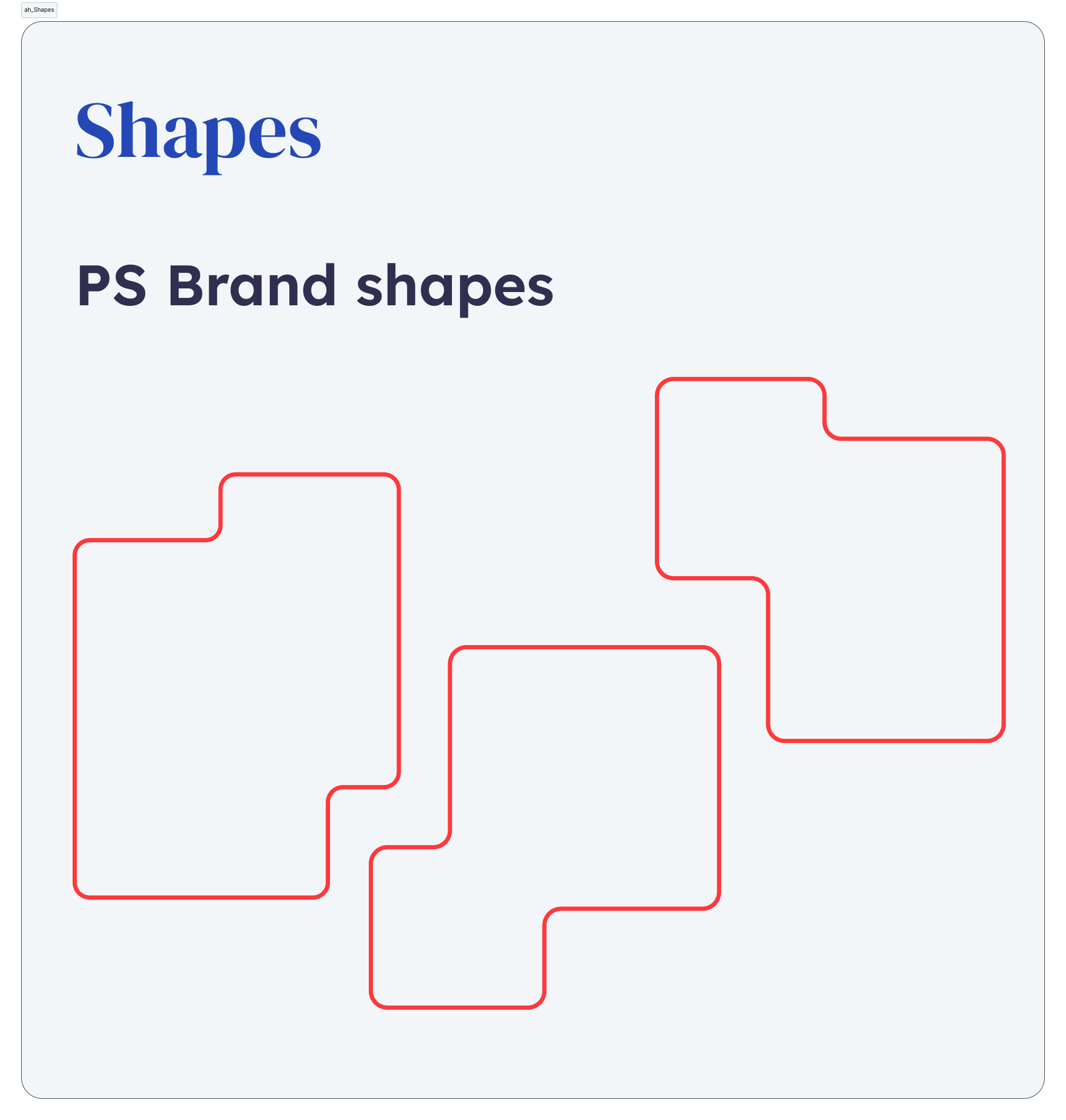
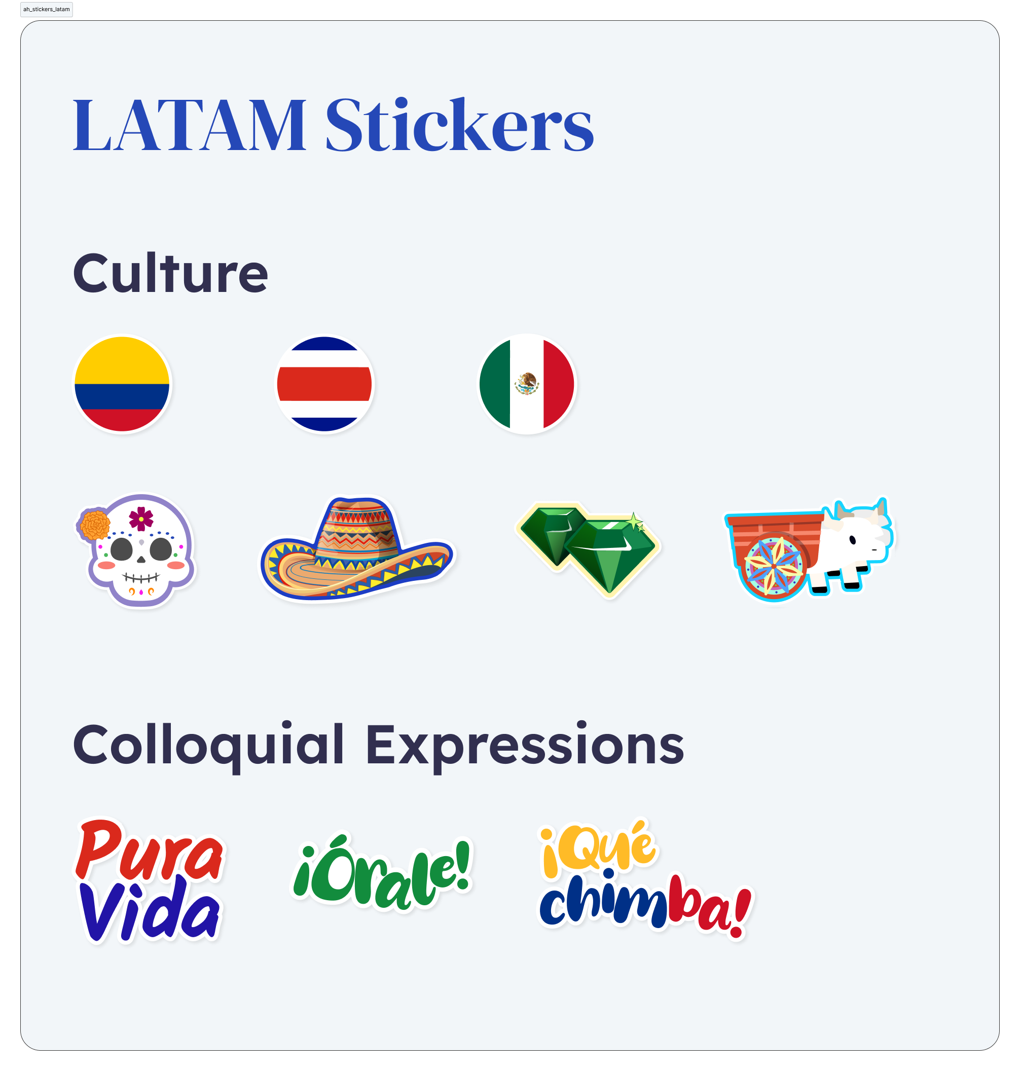
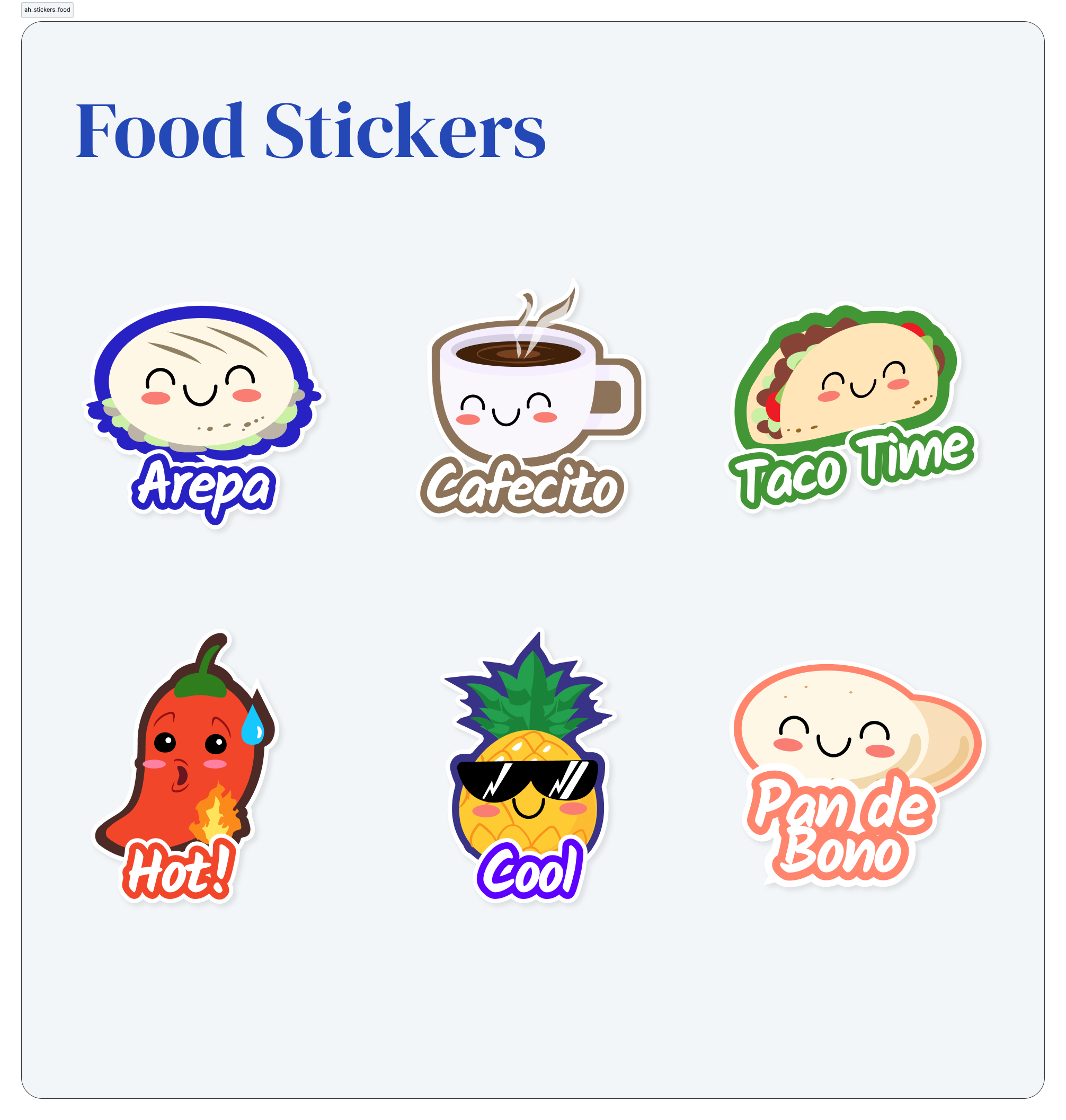
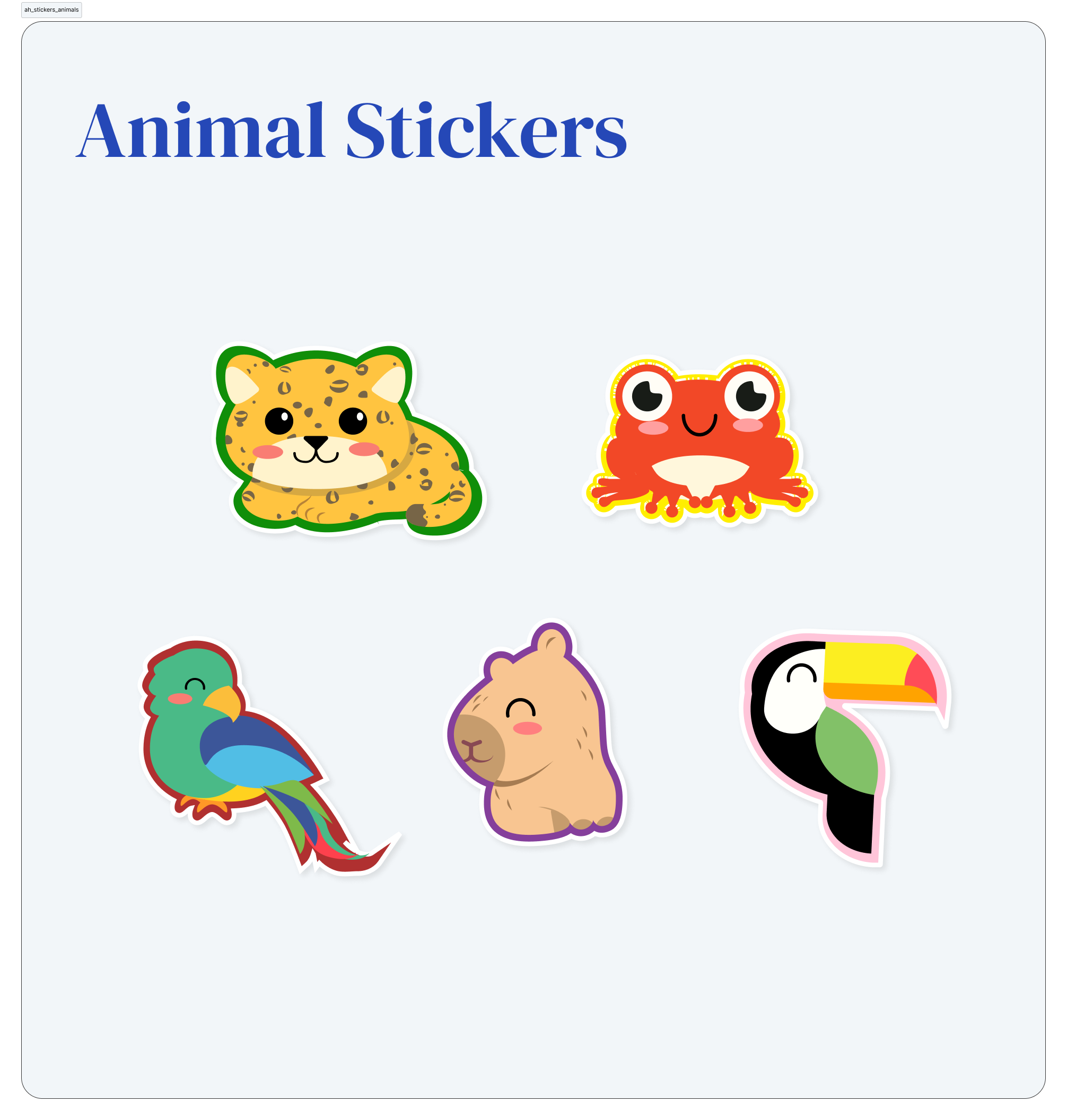
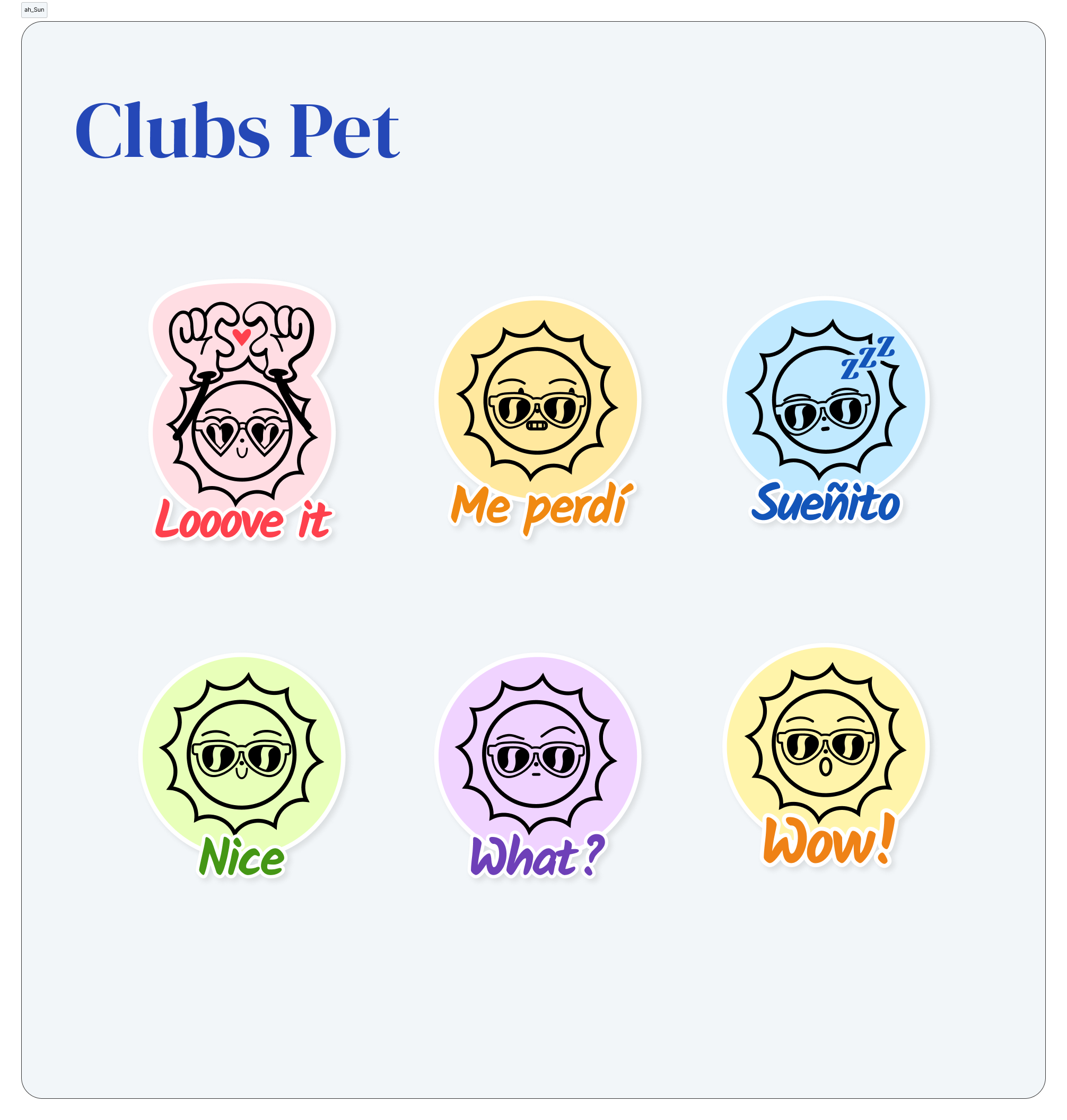
To reduce repetitive work, a reusable Figma library gave organizers visual assets they could use immediately — so teams could focus on creating valuable content instead of starting from a blank canvas.

  • Backgrounds
  • Patterns
  • Stickers
  • Layouts
  • Presentation assets
  • Reusable components
Documentation

A design system is only valuable if people can use it.

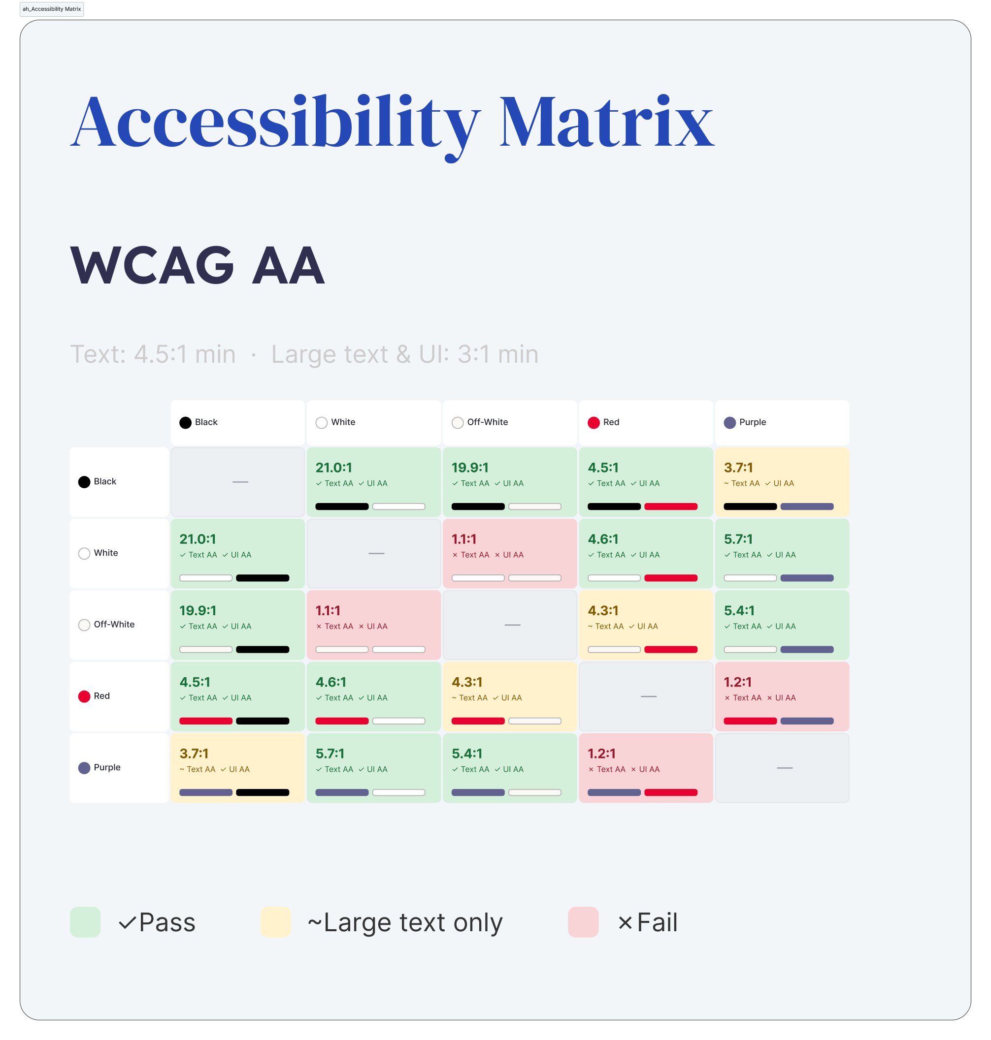
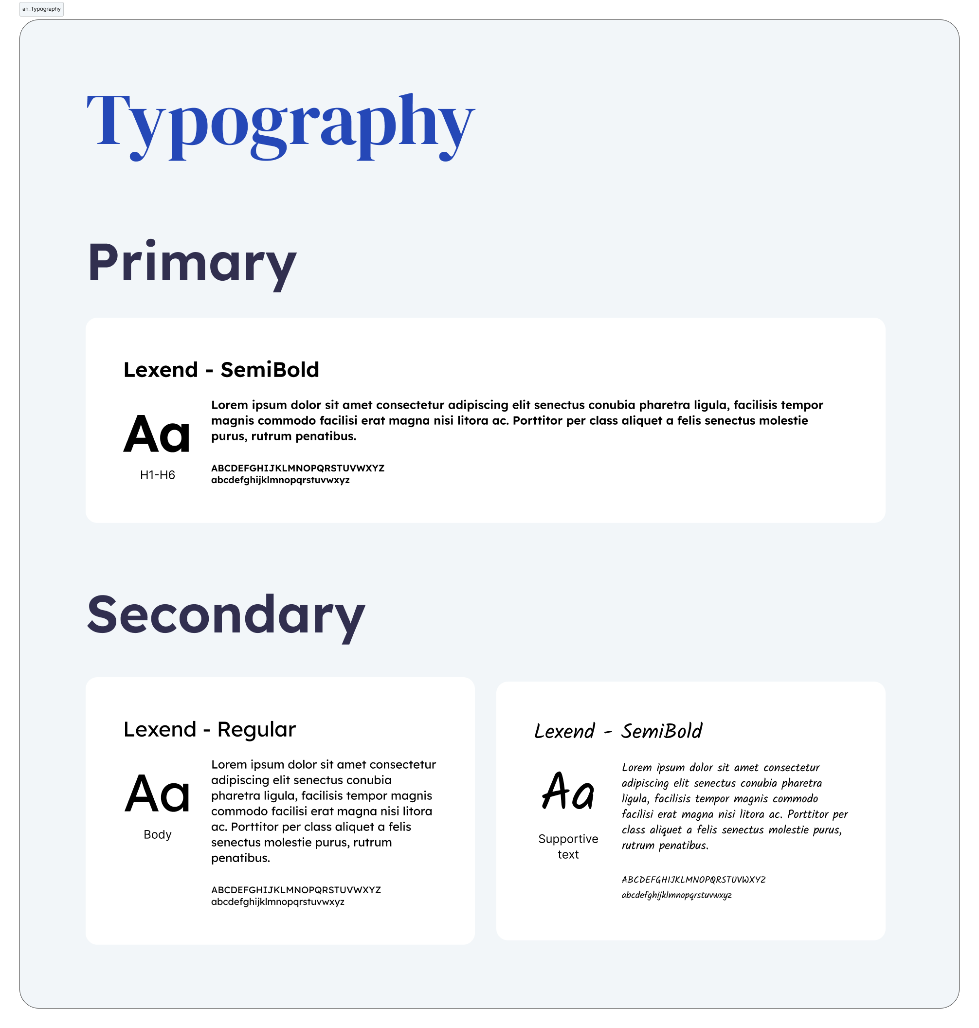
For that reason, every decision was documented through a practical style guide that explained not only what to use, but why. The documentation covered:

  • Visual language
  • Accessibility
  • Voice and tone
  • Content structure
  • Presentation best practices
  • Reusable assets
  • Do's and don'ts

The result wasn't simply a template. It became a playbook for future organizers.

Do's

DO Correct use
  • Design All Hands as a break, not a status update.
  • Create a relaxed, welcoming atmosphere with "break" energy.
  • Mix formats (not everything has to be a presentation).
  • Encourage different levels of participation (not everyone wants to speak — and that's okay).
  • Keep the content dynamic and inclusive.
  • Prioritize value over information.
  • Design every session intentionally (rhythm, energy, flow).
  • Include at least 1–2 genuinely interactive moments.
  • Rotate speakers, facilitators, and ownership.
  • Ensure every session leaves participants with:
    • One practical takeaway.
    • One emotional highlight.
  • Bring in external perspectives or voices from other regions when valuable.
  • Use time intentionally (don't rush, but don't drag things out either).
  • Plan each session at least one month in advance.
  • Assign clear MC and timekeeper roles.
  • Move operational updates to asynchronous channels (newsletter, blog, etc.).
  • Encourage presence (e.g., cameras encouraged, never required).

Don'ts

DON'T Incorrect use
  • Making it feel like just another meeting to "fill the agenda."
  • Turning it into a space for long status updates.
  • Repeating the same structure or format every time.
  • Making sessions predictable ("I already know what's coming").
  • Long monologues or too many slides.
  • Lack of interaction during key moments.
  • Rushing between sections or cutting short moments that are working.
  • Poor time management that creates frustration.
  • Robotic presentations with no personality or storytelling.
  • Lack of human connection or authenticity.
  • Giving little room to new voices (too much spotlight on a few people).
  • Always centering the same people.
  • Failing to include other regions or missing opportunities for global connection.
  • Forcing activities or using artificial engagement (prizes, etc.).
  • Visible multitasking during participatory moments.
  • Behaviors that disrupt the space:
    • Ego clashes.
    • Arrogance.
    • Calling someone out or making them uncomfortable in front of everyone.
Results

Value beyond a single metric.

Although this initiative wasn't measured through traditional product metrics, it created long-term value for the design organization.

The framework made it easier for future teams to organize monthly sessions while maintaining consistency across regions. It also demonstrated how design systems can support organizational experiences — not only digital products.

Reflection

UX principles extend far beyond interfaces.

By transforming workshop insights into a scalable framework, I helped turn a recurring internal meeting into a more intentional, reusable, and human-centered experience.

Sometimes the users aren't customers.
Sometimes they're your own colleagues.

Gallery

The system in use.

Next case study Building a Shared Design Language View case study