← Stories
Yallaya · Public Transportation · 2012

Designing One Experience Across Five Mobile Platforms

Sometimes your first UX project happens before you even know what UX is.

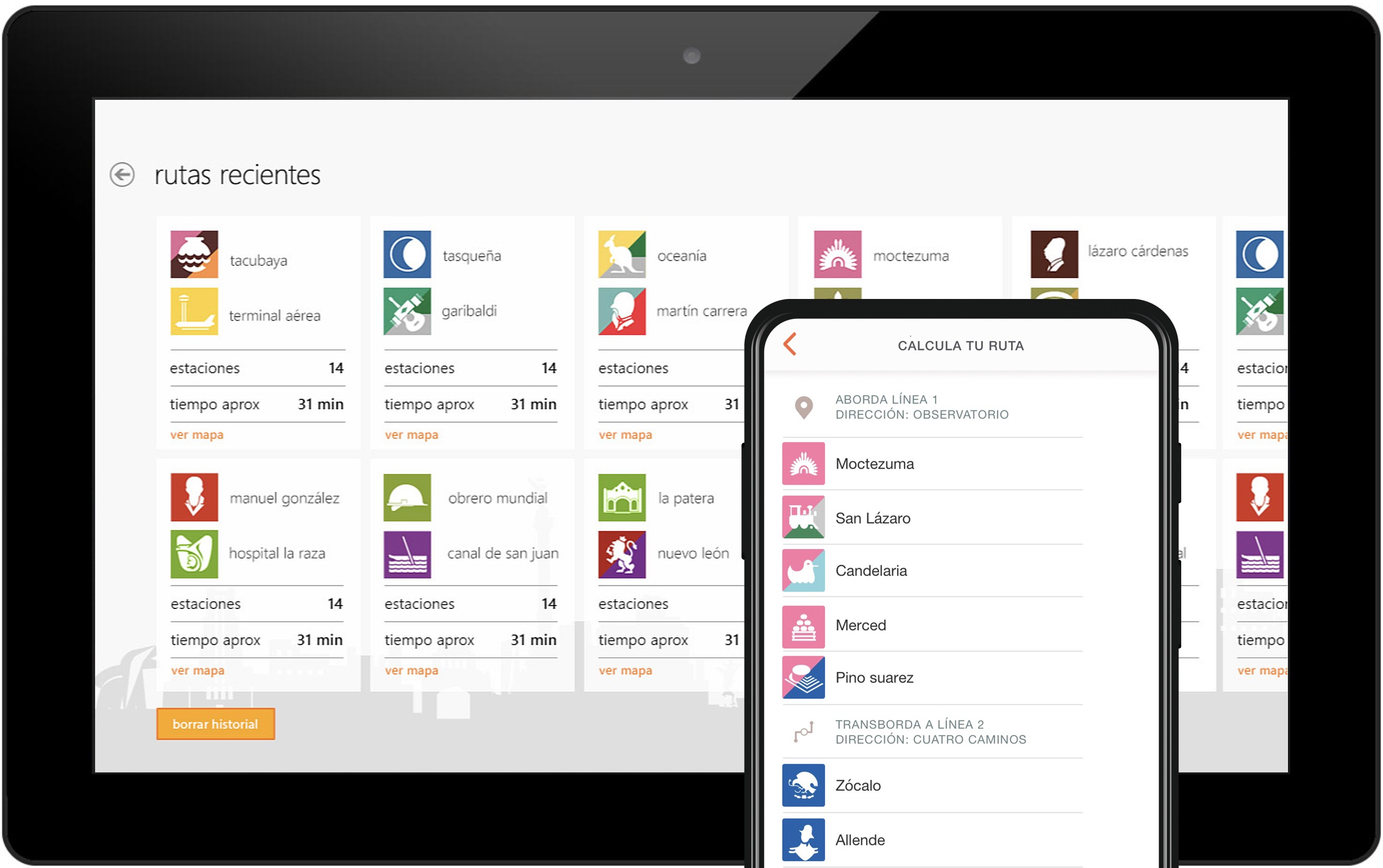
MB Ciudad de México app shown on a tablet and a phone, displaying recent routes and a calculated route through the Mexico City Metro.
MB Ciudad de México — recent routes and route calculator, shown on tablet and mobile.

A subway map isn't a transportation experience.

Company
Yallaya
Role
UX/UI Designer
Responsibilities
Research · Information Architecture · Visual Design · Interaction Design · Illustration · Cross-platform Design
Duration
2012 — present
Team
Small Startup
Platforms
Windows Phone · Android · iOS · BlackBerry · Firefox OS
The Challenge

The original application wasn't really an app. It was a static JPG of Mexico City's subway map. Users could zoom in. Zoom out. And that was the entire experience.

For anyone unfamiliar with the transportation system, the application answered almost none of the questions people actually had while moving around the city.

The opportunity wasn't to redesign the map. It was to redesign the experience of navigating Mexico City.
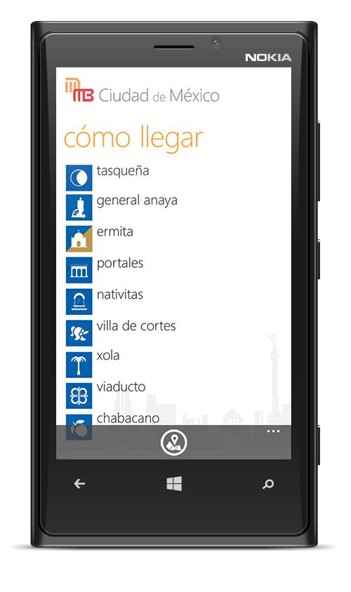
Before
metro_map_final_v2.jpg Pinch to zoom in. Pinch to zoom out. That's the whole app.
After
mymb v1.0 Search any station. Calculate a route. Find what's nearby.
An Opportunity to Explore

Nobody asked me to redesign the experience.

At the time, our startup had no active client projects. Instead of waiting for new work, the team decided to improve a product the company already owned.

The original goal was modest: refresh the application and explore what mobile technology could offer beyond a static image.

That freedom gave me something invaluable early in my career — the opportunity to experiment.

Early prototype No UI yet — just a blank canvas and a lot of questions.
Before I Knew UX...

I started asking people.

Nobody asked for user research. Nobody mentioned usability. Nobody suggested interviews.

But as a frequent Metro user myself, I couldn't stop thinking about everything the application failed to answer.

So I started asking friends, relatives and daily commuters simple questions.

Looking back, those conversations became my first user interviews.

Field notes A notebook, pen, printed maps and sticky notes — recreated to represent the process.
Looking Back...

I was already practicing UX.

In 2012... Today I'd call it...
Asking commuters questionsUser Interviews
Sketching ideas on paperLow-fidelity Wireframes
Watching people use the appGuerrilla Testing
Rearranging screensInformation Architecture
Trying different layoutsIterative Design
Prioritizing featuresProduct Thinking
From Questions to Features

People didn't need a prettier map. They needed answers.

Every conversation pointed toward the same problems. Instead of organizing features, I organized user needs.

  • 📍 Where is the closest station?
  • 🧭 How do I get there?
  • 🚇 Which line should I take?
  • 🔄 Where do I transfer?
  • 🚧 Is this station closed today?
  • 🕒 When does the Metro open?
  • 💳 How much is the fare?
Designing Information, Not Screens

The interface became much more than an interactive map.

Users could:

  • Search stations
  • Calculate routes
  • Find nearby stations
  • Save recent routes
  • Check operating hours
  • View ticket prices
  • Read service information
  • Understand transfers

The goal wasn't to add features. It was to reduce uncertainty during everyday journeys.

MB Ciudad de México showing a calculated route from Observatorio, transferring at Zócalo, ending at Allende.
Building a Transportation Language

Waiting for government approval didn't stop the project.

To use the official Metro iconography, we first needed authorization from the Mexico City government.

Rather than pausing development, I began manually recreating the transportation system from scratch.

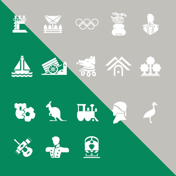
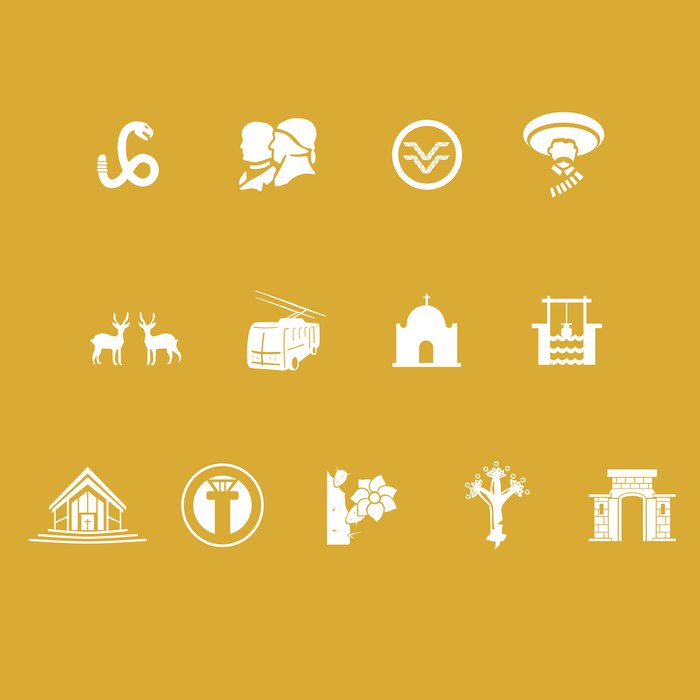
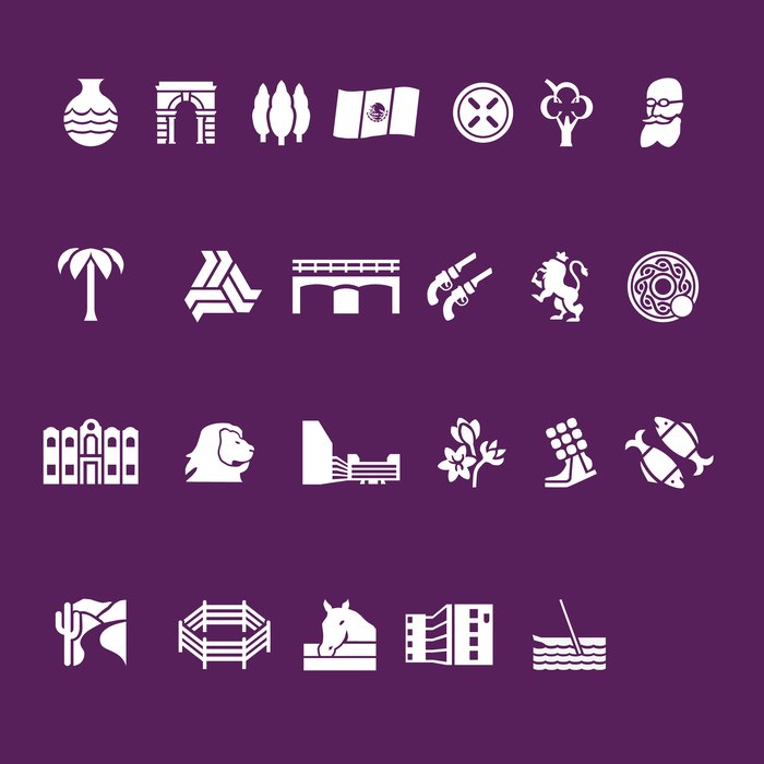
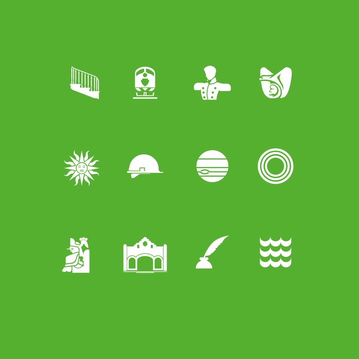
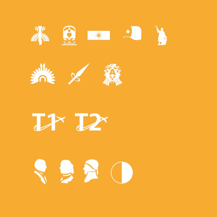
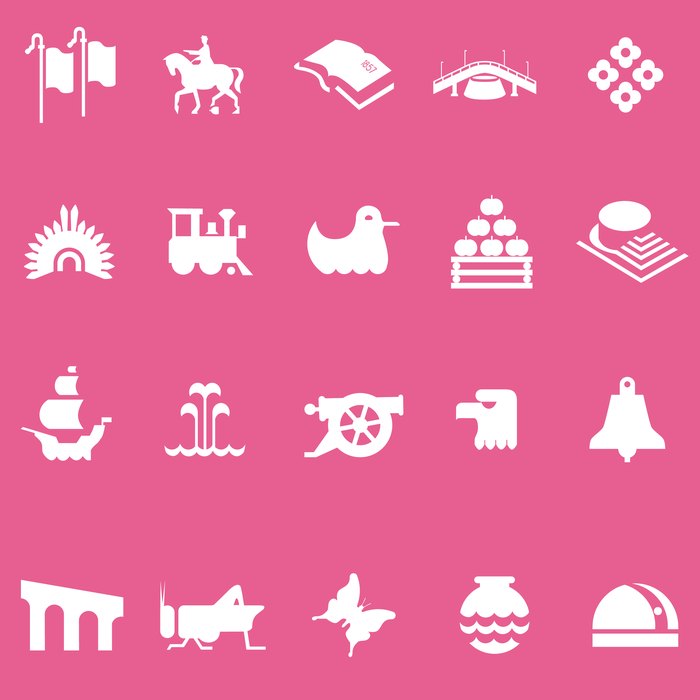
Using only basic geometric shapes in Adobe Illustrator, I rebuilt the first 10 Metro lines, part of Lines 11 and 12, Metrobús Line 1, and part of Metrobús Lines 2 and 3.

Once official assets became available, these handcrafted illustrations were gradually replaced. What began as a temporary solution became one of my earliest lessons in systems thinking and consistency.

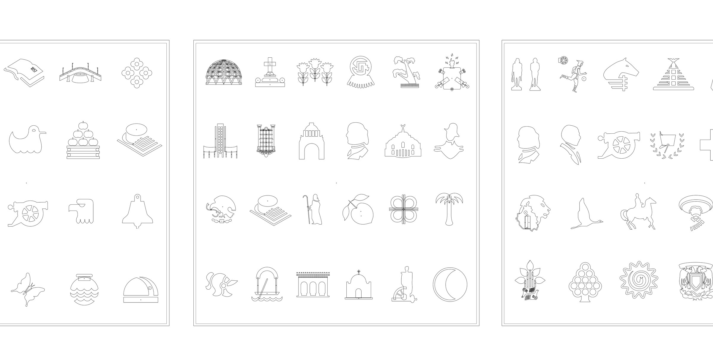
Every icon was manually recreated using geometric primitives, one line at a time.
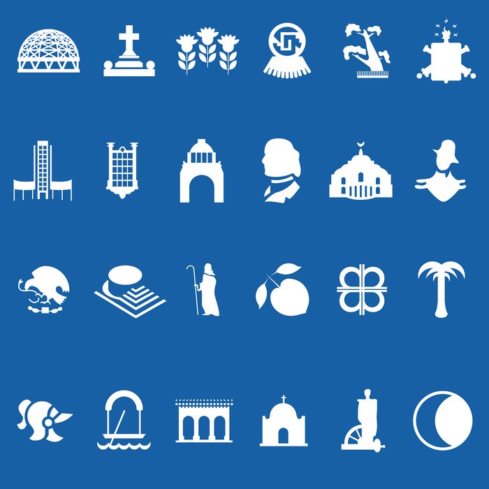
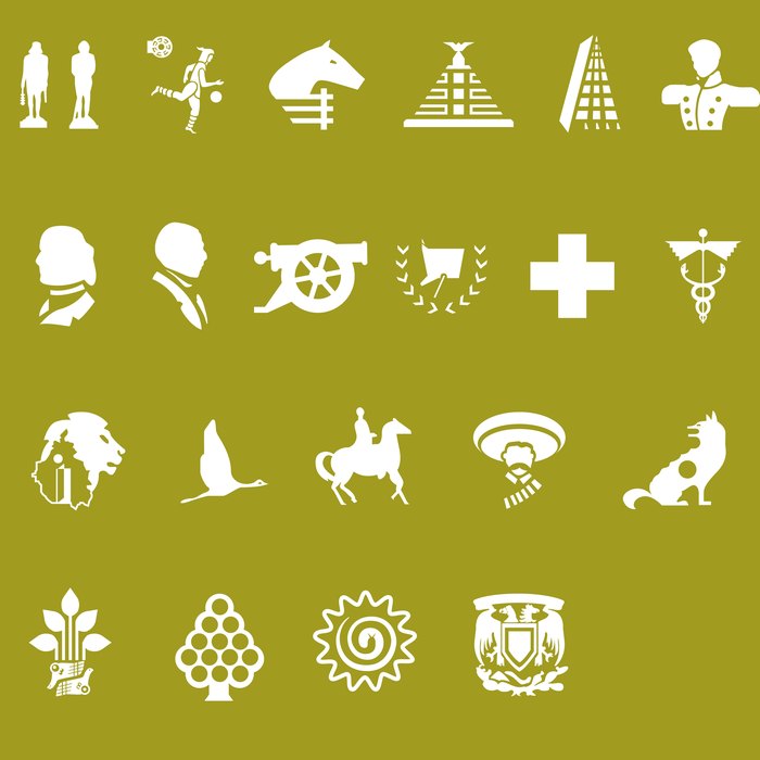
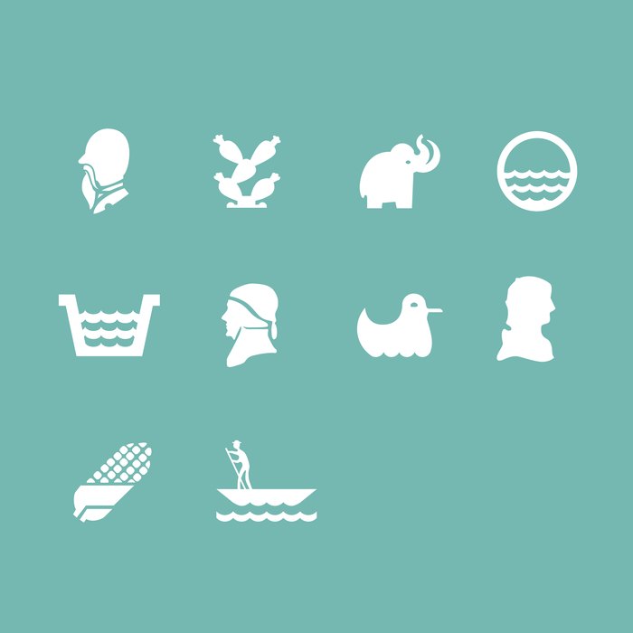
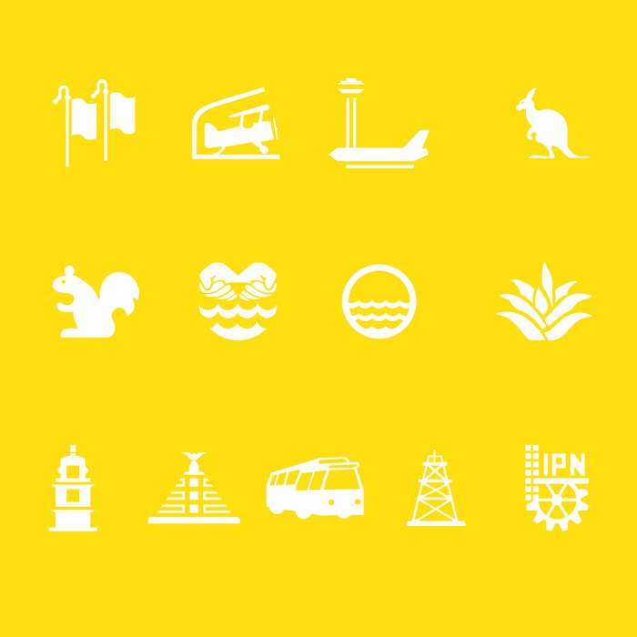
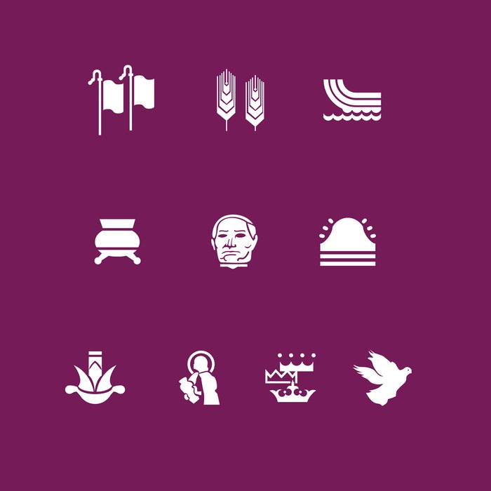
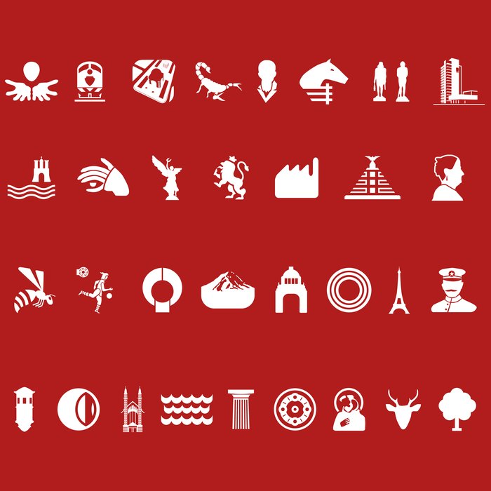
The full station iconography system reduced to a single-weight outline version.
The finished system, unified into a single outline weight for production.
Every Icon Had a Story

Icons that teach you the city.

One of the most fascinating discoveries during the project was learning that every Metro station symbol represents a place, a historical event or a cultural reference. Rather than using icons purely for navigation, the application let users tap any station to learn the meaning behind its symbol — turning a transportation tool into a small window into the city's history.

One Product, Five Platforms

The early mobile ecosystem was highly fragmented.

Rather than adapting a single interface, we designed native experiences for five operating systems. Each platform had different navigation patterns, interaction models and interface conventions. The challenge wasn't making everything look identical — it was making every experience feel native.

Windows Phone Android iPhone BlackBerry Firefox OS
Designing for Windows Phone

Beyond the application itself.

Windows Phone introduced Live Tiles, letting information live directly on the home screen. Instead of treating them as shortcuts, we explored ways to surface contextual information:

  • Nearby stations
  • Saved routes
  • Station history
  • Local landmarks
  • Frequently used destinations

The experience began before opening the application.

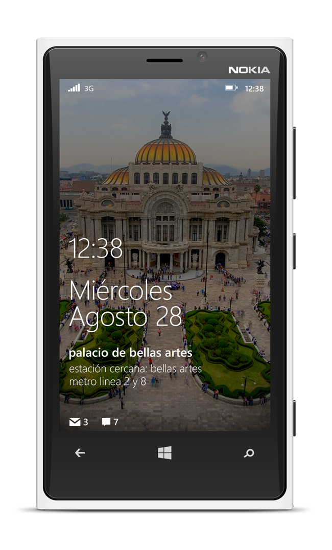
Windows Phone Live Tile showing Palacio de Bellas Artes with nearby station information.
A Live Tile surfacing the Bellas Artes landmark and its nearest station — before the app is even opened.
Product Evolution

What started as a simple Metro app kept growing.

Over time it expanded to include Metrobús, Light Rail, additional transportation systems, and new cities across Mexico. Watching an internal initiative evolve into a product still serving commuters more than a decade later has been one of the most rewarding parts of my career.

2012 Metro Windows Phone Android iPhone Metrobús More cities Still available today
Recognition

Microsoft took notice.

The product's success led Microsoft to invite our team to develop dedicated experiences for Windows Phone and Windows tablets.

For me, it was the first time seeing an internal initiative grow into a multi-platform product supported by one of the world's largest technology companies.

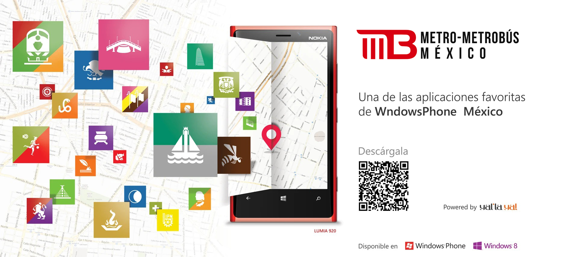
Promotional graphic reading 'One of WindowsPhone México's favorite apps', showing the app's station icons, a Lumia 920 running MB Ciudad de México, and a download QR code.

This wasn't simply my first mobile application. It was the moment I naturally began asking questions before designing solutions.

Years later I learned terms like Information Architecture, User Research, Interaction Design and Product Thinking. But the mindset was already there — curiosity, observation, empathy. More than a decade later, those same principles continue shaping every product I design.

Next case study Transforming Customer Support into a Self-Service Platform View case study