← Stories

Transforming Customer Support into a Self-Service Platform

How challenging a simple FAQ request reshaped Citibanamex's digital support strategy.

The website helped people become customers. It didn't help them once they already were.

Role
Senior UX Designer
Responsibilities
Product Strategy · UX Research · Information Architecture · Benchmark Research · User Testing · UI Design · Developer Handoff
Duration
2017 – 2018
Team
UX · Product · Content · SEO · Development · Legal · Business Stakeholders
Key decisions
01

Challenge the brief

02

Design for discoverability

03

Prioritize knowledge

04

Validate navigation

Impact at a glance
25% Fewer calls to Audiomático within the first two months after launch
  • Reduced operational costs
  • 4-month roadmap extension
  • Research-led strategy
  • Scalable platform
  • Architecture still relevant 8 years later

When I joined the project, Citibanamex was investing heavily in its digital ecosystem. New products were constantly being introduced, digital banking was expanding, and initiatives such as CoDi were beginning to transform financial services in Mexico.

The public website reflected that strategy. Its primary objective was to attract new customers and promote the bank's products. But once someone became a customer, the digital experience changed completely.

Support depended almost entirely on Audiomático — the bank's automated phone system. Customers waited on hold, navigated long voice menus, and often struggled to find answers to relatively simple questions.

The digital journey ended precisely where customers needed it most.
The Request

The initial request sounded straightforward: design a FAQ page. At first glance, it seemed like the obvious solution.

But after reviewing the scope, another Senior UX Designer and I reached a different conclusion. A page containing hundreds of questions wouldn't eliminate frustration — it would simply move it from one channel to another. Instead of waiting on a phone call, customers would spend their time searching through an endless list of articles, hoping the answer happened to be there.

The problem wasn't information. It was discoverability.

Challenging the Brief

Rather than optimizing the requested solution, we challenged the premise. Before designing a single screen, we researched how leading digital products approached customer support.

Companies such as Google, Facebook, and Uber were no longer building traditional FAQ pages — they were creating self-service experiences organized around user intent. At the same time, we analyzed the Mexican banking landscape. None of the major banks had adopted a comparable approach.

That combination became our opportunity.

Adoption of customer support features by brand Animated chart comparing Banorte, Bancomer, Banregio, Citibank, Commonwealth, BNZ, Netflix, and Dropbox across eight features (self-service, search, FAQs, AI, community, contact, social media, and feedback), showing the level of implementation as rings that fill in. Selfservice Search FAQ's AI Community Contact Social Feedback Banorte Bancomer Banregio Citibank Commonwealth BNZ Netflix Dropbox
Benchmark research across banking and non-banking digital products — self-service, search, FAQ, and more. Each ring fills to its real adoption level as you scroll.

We weren't proposing a prettier interface. We were proposing a different product strategy.

Winning Stakeholder Trust

The proposal was received with enthusiasm. But approval wasn't immediate — changing the project's direction required more than design approval. Legal teams reviewed contractual timelines to determine whether the roadmap could accommodate a broader solution.

If time became a constraint, we had already prepared a phased strategy:

Phase 1
Launch the requested FAQ experience.
Phase 2
Evolve it into the self-service platform we envisioned.
Stakeholder engagement and roadmap planning

A few days later we received confirmation: the project could be extended by four months. That decision completely changed what we were able to build.

Designing for Discovery

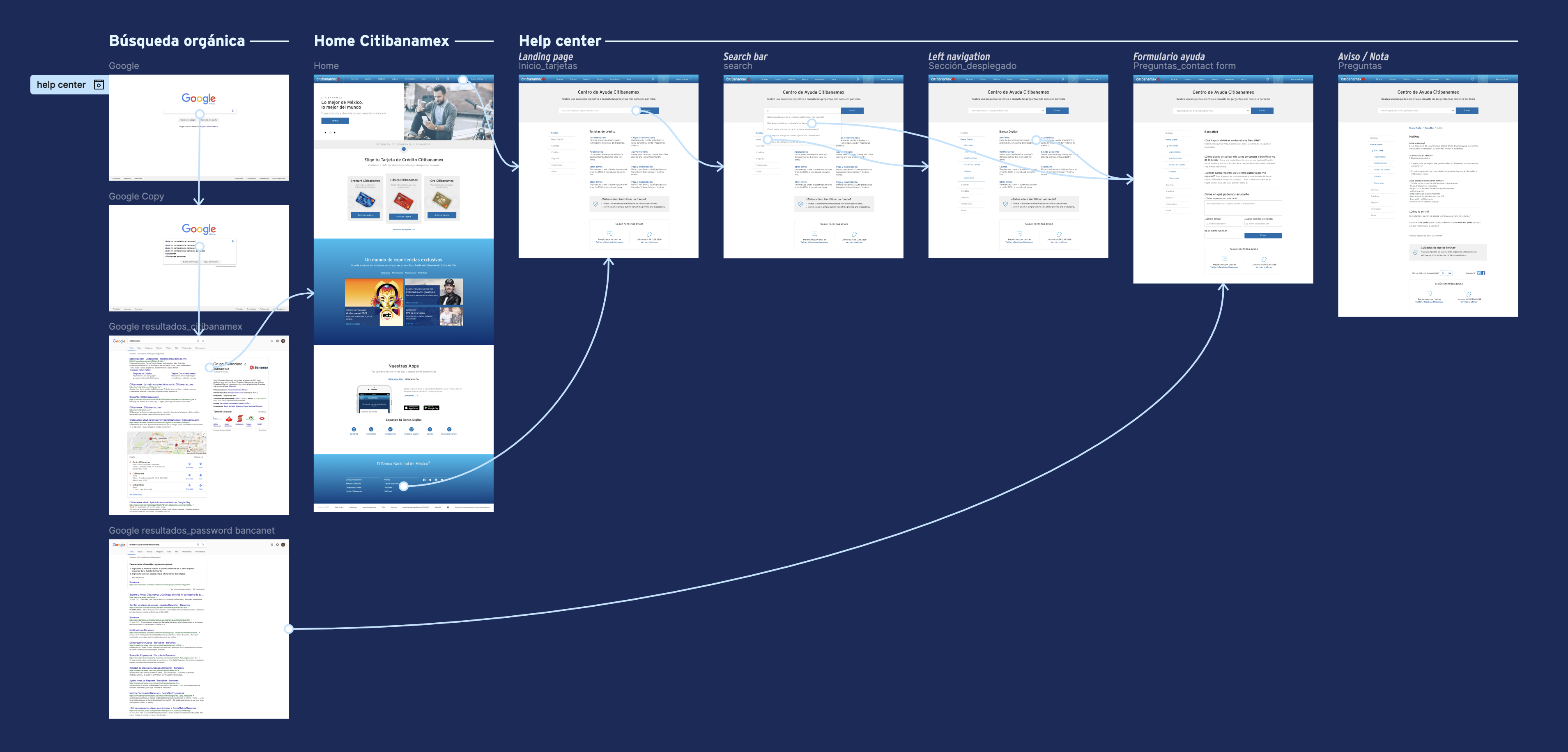
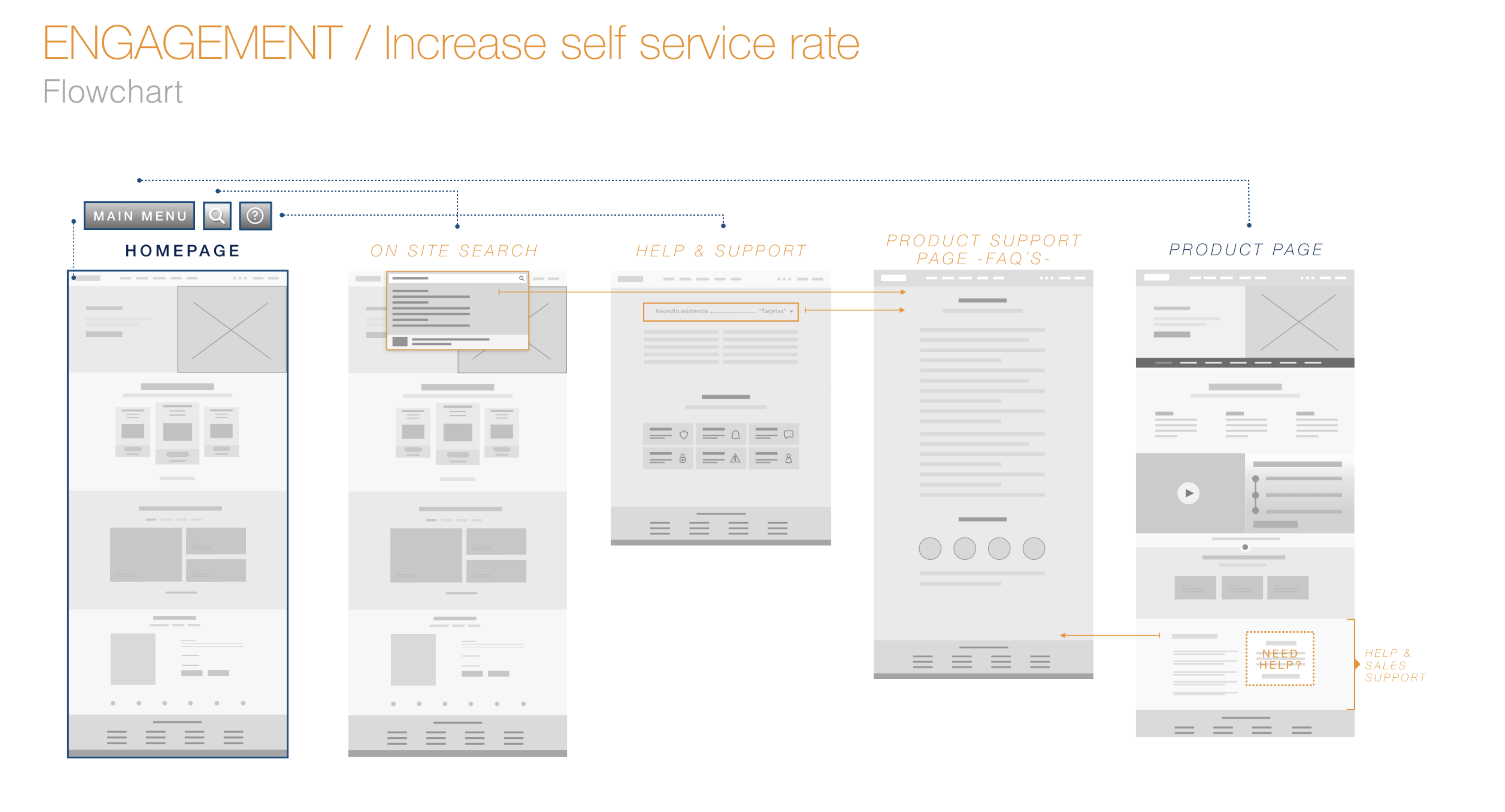
A Help Center only creates value if customers can actually find it. Because no comparable experience existed within Mexican banking, we couldn't rely on established navigation patterns. Instead, we studied two different discovery journeys.

Organic Search

Working closely with the SEO team, we identified the keywords customers naturally used when searching for help online. The objective was simple: when users searched for support related to Citibanamex products, the Help Center should become the first destination.

On-Site Navigation

Rather than hiding support behind multiple navigation levels, we introduced contextual entry points throughout the experience. Each product page included a dedicated "¿Tienes dudas?" section linking directly to the Help Center, which also remained permanently accessible from the global footer.

Navigation prototype for the Help Center

The goal wasn't simply to build a Help Center. It was to make finding help effortless.

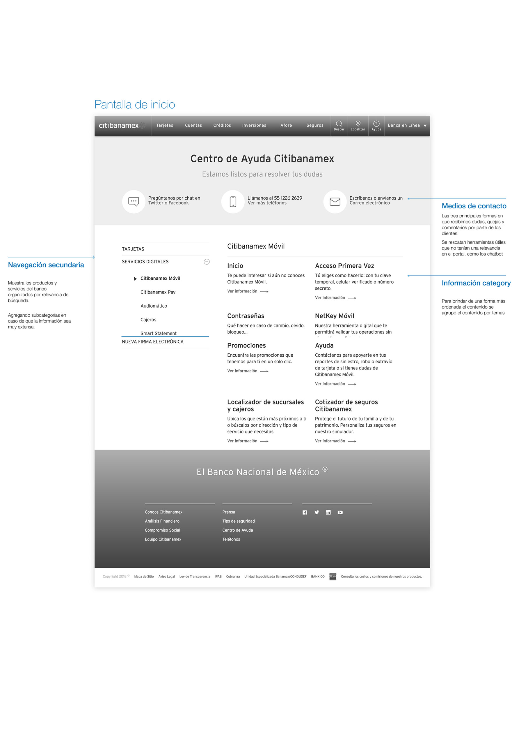
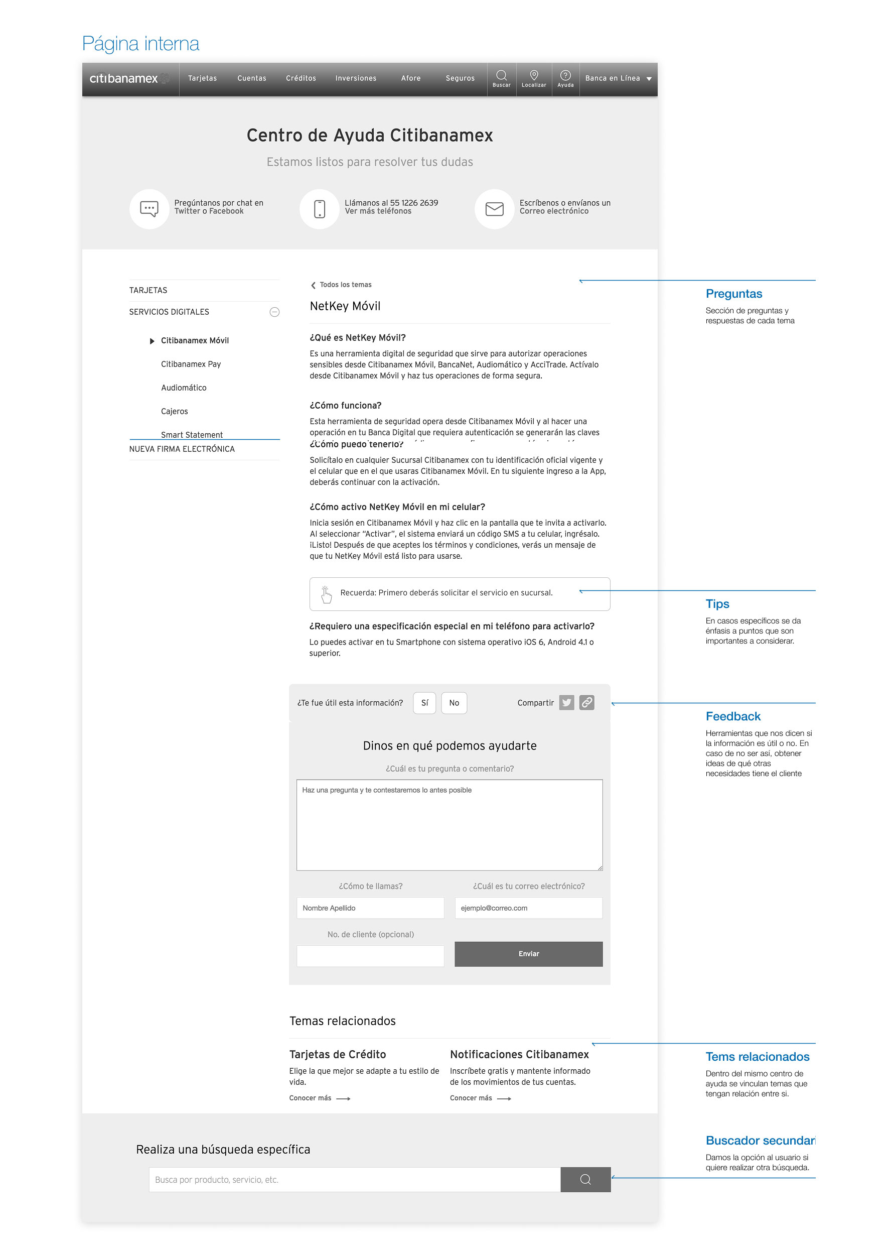
Organizing Knowledge

The next challenge wasn't writing articles — it was deciding how knowledge should be organized. We began by analyzing support data. Credit Cards generated the highest number of customer inquiries, making them the natural starting point.

Within each product, content wasn't ordered alphabetically. It was prioritized according to real customer behavior — questions that generated the highest demand appeared first. This transformed the experience from a static documentation site into a guided support journey.

Content strategy — prioritization framework Content strategy — prioritization framework

The first release focused on three high-impact areas:

Credit Cards

Highest inquiry volume

Digital Banking

Fast-growing product line

Afore

High-complexity questions

Future products would be incorporated gradually as the bank continued expanding its digital services. Each new product required answering the same questions:

  • Does it deserve its own category?
  • Where will customers expect to find it?
  • How does it affect the existing information architecture?

Validation

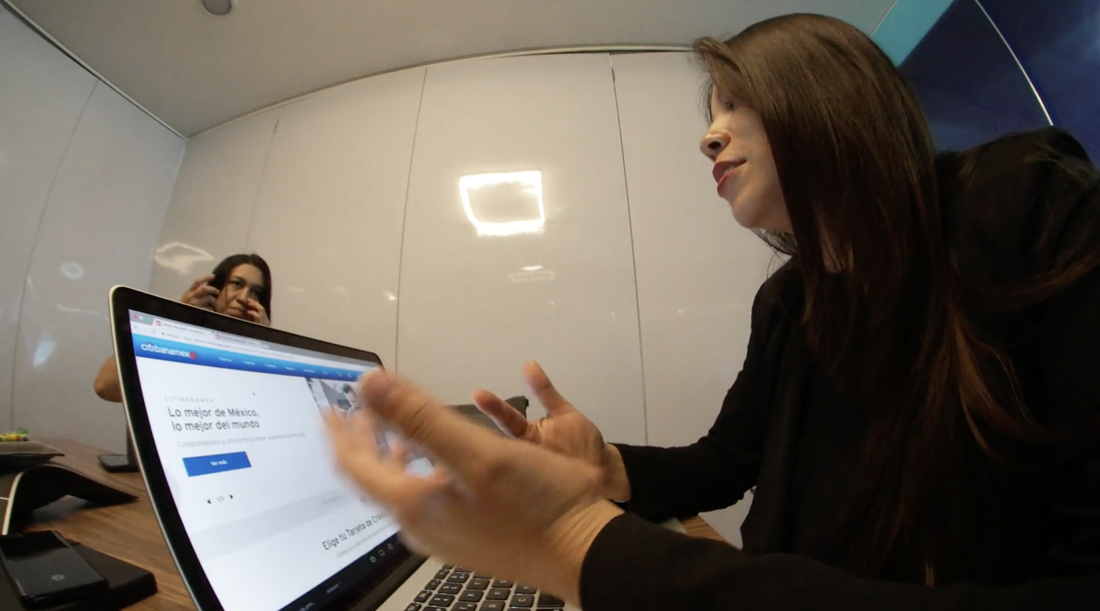
Moderated usability testing session with a real customer
Moderated usability testing — real customers, real support scenarios, documented on video.

"I found it! Much faster."

Usability testing participant

Every navigation decision was validated before development.

Impact

Customer Experience

  • Replaced long phone waits with immediate digital self-service.
  • Reduced uncertainty by organizing information around products and priorities.
  • Preserved human support for exceptional or complex situations.

Business

  • Reduced dependence on Audiomático for repetitive inquiries.
  • Lowered operational costs by shifting common support requests to digital channels.
  • Expanded the role of the corporate website beyond customer acquisition.

Product

  • A scalable platform, capable of incorporating new banking products over time — not a static repository of FAQs.
  • Years later, the visual interface has evolved. The underlying information architecture hasn't needed to.

The interface changed. The strategy didn't.

When the project began, the request seemed simple: build a FAQ page. Looking back, I'm grateful we questioned that assumption. The most valuable outcome wasn't designing a better interface — it was helping the organization recognize that customer support is part of the product experience.

Next case study Transforming a Wallet into a Business Platform View case study